DO YOU THINK that your photography is good? Do other people — people that aren't your friends or family — think that it is good? How would you feel if one of your photographs found its way into a junk shop or a flea market, and someone purchased it only because of its frame?
Ultimately, we must be humble enough to realize that no matter how much artistic vision and effort we put into something, a buyer simply might like our photograph only because it is nicely framed.
When I did a Google search for the phrase “I bought it for the frame,” I got over ten million search results, with many people telling of some print or painting they found at a junk shop, but which they discarded, simply because they liked the frame. Now we mustn't jump to the conclusion that the frame-buyers are ignorant, tasteless philistines. Perhaps your photograph isn't all that good. Perhaps the frame is really good. [NOTICE: I must admit to having a bit of anxiety whenever I go to a book fair or used book store, thinking that I might find one of my own books being sold cheap.]
Apparently, according to the same Google search, lots of people also buy bicycles only for their frame. They plan to strip the frame of all the seemingly more critically important stuff that actually makes the bicycle work, such as the wheels, gears, and chain. Certainly these working components are more important than the frame? Doesn't the frame just sit there? The answer is that in many respects these components are more important, and the components that just happen to be attached to the frame may not be all that good or fitting for the purchaser. The brakes and tires on a bicycle become gradually worn with use and slowly become less effective over time, and a bicycle rider can choose to replace them whenever it is convenient. But a bicycle frame must be perfectly durable, and it must not ever fail during use, for it cannot be repaired in the field: a frame does not slowly lose its functionality over time, for the welded joints on a frame are either rigid or are broken with no significant intermediate state. A frame, of course, can be repainted as needed.
So what kind of framed photograph would be more valuable to most any given person: an excellent portrait of someone else's child, or a cheap snapshot of their own child? We ought to realize that prints and paintings are more important than a frame, but they tend to be more personally important. If someone buys a framed print at a flea market and then discards the original print, that is because their print is more important than the original. Likewise, someone may purchase a used bicycle, but they might replace the seat for one that is more comfortable for them; they might replace the brakes because they are worn, but if the frame isn't good, they won't buy the bicycle.
A photograph or painting may be chosen because of a particular style of a room, or because of a particular mood expressed, or its use of particular coordinating colors. The subject matter may spark the imagination of the buyer, or the subject may invoke particular memories or devotions. An image may be discarded because it no longer fits the decor of the room, or it may invoke unpleasant memories: maybe it is faded or worn, or it is no longer interesting, or it is out of style.
Now, there are some artists, particularly in the past, who strove to make images that have a more universal, timeless character, that expressed objective beauty and the sublime. This is rare today because modernity rejects the eternal and universal in favor of that which is transitory and cheap. This means, perhaps, that contemporary works are more prone to being quickly discarded.
People may buy a print because of its frame, but the frame is not bought for its own sake, no matter how well it is made or decorated, but because it is ultimately intended to enclose a print or a painting. I know of no museum or gallery that is dedicated to the presentation of frames as objects of art (although this might be an exception), but there are vast numbers of merchants — including art galleries — that sell frames in a wide variety, and the cost of these frames may equal or exceed the cost of the image that is presented within it.
Frames are works of art in themselves (as is anything intentionally well-made by man's intellect), but their purpose is mainly in relationship to the fine art contained within them. The word ‘fine’ in ‘fine art’ is related to Aristotle's understanding of the “final cause” or ultimate purpose of a thing. The final cause of a frame is to support, display, protect, enhance, and delineate the work of art contained within it, as well as provide a visual transition between the work of art and its location. The buck stops at the image contained in the frame, as it is the final cause of the art: the job of art is complete and the viewer's job of looking at the image begins. But this does not mean that the frame is unimportant, for it has important functions, but it is subservient to those things, the images, which are greater. Even though we have differing opinions on what makes a good print or painting, we should not be surprised that most of us would largely agree on what what makes a good frame, for frames have a more definite purpose.
Getting a good understanding of composition is difficult, because it involves human psychology. The many proposed rules of composition seem to rest on shaky theoretical ground, and many of the supposed examples of the use of the rules are unconvincing. However, one element of composition is concrete and objective, that being the framing or the specific crop of the image. See the article Composition, Part 1 - the Frame for a more in-depth discussion of this. The objective framing of an image, due to a specific crop, can be be a powerful tool of composition if used well, and bad framing can certainly harm an image.
As the vast majority of images are rectangles, this suggests the good use of harmonic proportions between the length and width of the image with the proportions of the matting and size of the frame. The common standard print, matte, and frame sizes do express proportions that harmonize well with each other. Attempts at making custom frames and mattes for a non-standard print size will generally be expensive and error-prone. Custom sizes may also look awkward if the maker does not apply the mathematics of proportion ahead of time: for example, it may be possible to harmonize an image with a large aspect ratio within a frame with a smaller aspect ratio if the margins or matting are well-chosen, but if the ratios are not chosen well, the final object may look ridiculous, cheap, or inartistic.
For all these reasons, I think that it would be prudent if photographers give serious consideration to framing, since, after all, nearly every print that will be displayed on a wall needs a frame, and for the simple fact that a purchaser may buy your print because they like its frame.
Showing posts with label composition. Show all posts
Showing posts with label composition. Show all posts
Tuesday, November 27
Wednesday, August 29
Composition in Landscapes and the Photography of Marcin Sobas
SOME INSPIRATIONAL LANDSCAPE photography, from Polish photographer Marcin Sobas, can be found here.
Sobas has lately gained a lot of positive attention for his remarkable landscapes of Moravia and Tuscany.
A while back, I made an effort to learn why some landscape photography has great appeal, and I attempted to identify the common characteristics of great landscape images. Now, there is no end to advice that can be found on the subject of landscapes, but I desire to discover those characteristics that are more certain and definite. Some of my observations can be found in the article Composition, Part 2 - Composition and Subject in Landscape Photography.
From my analysis of highly-regarded landscape images, I found some characteristics that nearly all of them share. These ought not be considered unbreakable rules, nor should this list be considered exhaustive, for they are not the only things that photographers consider; rather this is simply what I saw, and there could be great landscapes that are otherwise.
1. Almost by definition, a landscape ought to have a superhuman scale. Good landscapes depict scenes that dwarf the human person, and so have the characteristic of sublimity. The sublime describes “a sense of awe, grandeur, or greatness, something that is lofty to an extreme degree, so much so that it dwarfs the human person in insignificance.” See the article On the Sublime for more details. A sublime scene may or may not be a beautiful scene, but it certainly has to be big, and Sobas’ images show rather big scenes that are sublime and beautiful.
Imagine taking a photograph of a small garden; the flowers may be beautiful, but the scene will likely lack sublimity, because the garden is of human scale. This problem of scale concerned the designers of the Victorian-era Tower Grove Park in Saint Louis, Missouri, USA, and they knew that the sublime would not be possible in their park. The results are pretty, but not lofty, as I show in the article here.
2. Unusual use of lenses can make for better landscape photos. Beginning landscape photographers often desire ultra-wide angle lenses so as to “get the whole scene in.” But consider that wide angle lenses not only get in the whole scene, but at the same time they make distant objects recede in size and scale, taking away the impression of sublimity. Wide angle lenses instead emphasize the foreground, which may include objects of a more human scale, while reducing the grand vistas of the background.
Instead, Sobas often uses a telephoto lens, a Canon 70-200mm f/4 L-series lens, which gives a horizontal angle of view of 18.2 to 6.4 degrees on his Canon 40D camera. This narrow angle of view provides foreshortening — making distant objects appear closer to each other — as we see with the hills in the photograph above. The use of a telephoto exaggerates the vertical dimension at the expense of perceived depth. Would the scenes have appeared as sublime if he had stood closer, and had used a wide-angle lens?
You may, however, consider the final size of your image and how close you will view it: if you are creating a panorama that will cover the wall of a room, then small detail becomes more prominent, and so a wider angle of view may not decrease the impression of sublimity.
Also note that Sobas often uses a high camera angle. Instead of just seeing one line of ridges, we can see multiple lines of ridges and hilltops, one behind the other, which increases the grandeur of the scenes.
3. Good landscapes are almost always taken around sunrise or sunset, or at night. I’m not saying that good landscapes can’t be taken at midday, I’m just saying that they typically aren’t. The lighting angle during the extremities of the day is low, and so shadows thrown are long, and serve to model the undulating terrain. In this way, early or late landscape photography is like using Rembrandt lighting for portraiture, which models the human face with shadow. Harsh lighting, like we find at midday, will often underexpose shadows or overexpose highlights; on the contrary, with the sun at a low angle, the sky acts as a great fill-in light. The attenuated orange light from the sun provides a good contrasting color with the blue of the sky, giving us far more color during the preferred times of day.
According to this interview, Sobas prefers cloudless mornings for his shooting. I’ve noticed that while sunsets are often pretty, the sky at sunrise is usually dull, but this makes for a better, more uniform light for this kind of work.
4. Unusual weather can help improve a landscape photo. Dramatic stormy skies and snow on the ground can turn an ordinary landscape into something more special. Sorbas likes foggy mornings to make his photos more interesting:
He recommends getting some knowledge of weather so as to predict the best times for taking photos. The Lawrenceville Weather website includes a fog forecast map for the lower 48 United States; I refer to this map frequently to find interesting shooting conditions. Also of use is The Photographer's Ephemeris, an application that calculates the angle of the sun; this can help to predict the direction of shadows, which may lead to better compositions.
5. Good landscapes usually have a full range of tones or color. Sobas subtly post-processes his images, and the final results do have a broad range of tones. The simple use of the levels tool, and saturation or vibrance — not done too strongly — can enhance a landscape photo without making it look overprocessed. Choosing the right subject, exposure, white balance, time of day, time of year, and weather conditions all contribute to getting good color.
6. Good landscapes typically have a unity and harmony, and avoid distracting details. A certain measure of abstraction works well. Again, many of Sorbos’images are so abstract that they, at first glance, appear to be paintings, but instead they are almost undoubtedly straight camera images with some mild postprocessing.
This is perhaps the most difficult part of landscape photography: what subject, what camera position, and what lens and cropping best suit the image? A good photographer ought to be able to view a scene, taking in both the subject as well as potentially distracting elements, instead of merely doing the same back home on the computer. Especially when an image is to be displayed at a small size on a computer screen, a large measure of abstraction is needed, more so than if the final image is larger.
7. Remember that photographs are made to be viewed by human beings, and adding a bit of human interest to an image may make a photograph more interesting to your viewers. Having a human in a landscape can draw attention to it, and in the best examples, can transform an ordinary landscape photograph into a dreamscape, deepening its emotional impact. From what I've seen, Sobas does not often include humans in his photos, but we do see buildings, boats, roads, and sometimes animals. I might add that most or all of these images depict landscapes that have been heavily altered by humans, perhaps over thousands of years, but in a harmonious way, and so they have an organic look to them.
8. Good landscape photos are usually made with good equipment and good technique. Because landscapes may not be as intrinsically interesting as a human figure, it takes extra effort to attract the eye. Journalistic style images can be rough, and that does not distract from them; indeed, a rough image may have a feeling of immediacy about it. Landscapes, on the other hand, are more timeless, and seem to call for more perfection.
There are any number of rules or principles used in landscape painting and photography, and the brief list above are merely my observations of what most good landscapes definitely seem to share. I haven’t mentioned commonly-cited principles such as the use of diagonals, leading lines, the rule of thirds, balance, avoiding subjects leaving the scene, the use of S curves, having a definite center of attention, and so forth, simply because these principles, in my mind, aren’t certain, or perhaps I simply don’t understand them well enough. Human psychology is complex, but some things are more certain than others; getting the basics right is more important than the subtleties. After knowledge, experience, and inspiration, comes more perfection.
 Ruins by Marcin Sobas |
Sobas has lately gained a lot of positive attention for his remarkable landscapes of Moravia and Tuscany.
A while back, I made an effort to learn why some landscape photography has great appeal, and I attempted to identify the common characteristics of great landscape images. Now, there is no end to advice that can be found on the subject of landscapes, but I desire to discover those characteristics that are more certain and definite. Some of my observations can be found in the article Composition, Part 2 - Composition and Subject in Landscape Photography.
From my analysis of highly-regarded landscape images, I found some characteristics that nearly all of them share. These ought not be considered unbreakable rules, nor should this list be considered exhaustive, for they are not the only things that photographers consider; rather this is simply what I saw, and there could be great landscapes that are otherwise.
1. Almost by definition, a landscape ought to have a superhuman scale. Good landscapes depict scenes that dwarf the human person, and so have the characteristic of sublimity. The sublime describes “a sense of awe, grandeur, or greatness, something that is lofty to an extreme degree, so much so that it dwarfs the human person in insignificance.” See the article On the Sublime for more details. A sublime scene may or may not be a beautiful scene, but it certainly has to be big, and Sobas’ images show rather big scenes that are sublime and beautiful.
Imagine taking a photograph of a small garden; the flowers may be beautiful, but the scene will likely lack sublimity, because the garden is of human scale. This problem of scale concerned the designers of the Victorian-era Tower Grove Park in Saint Louis, Missouri, USA, and they knew that the sublime would not be possible in their park. The results are pretty, but not lofty, as I show in the article here.
2. Unusual use of lenses can make for better landscape photos. Beginning landscape photographers often desire ultra-wide angle lenses so as to “get the whole scene in.” But consider that wide angle lenses not only get in the whole scene, but at the same time they make distant objects recede in size and scale, taking away the impression of sublimity. Wide angle lenses instead emphasize the foreground, which may include objects of a more human scale, while reducing the grand vistas of the background.
Instead, Sobas often uses a telephoto lens, a Canon 70-200mm f/4 L-series lens, which gives a horizontal angle of view of 18.2 to 6.4 degrees on his Canon 40D camera. This narrow angle of view provides foreshortening — making distant objects appear closer to each other — as we see with the hills in the photograph above. The use of a telephoto exaggerates the vertical dimension at the expense of perceived depth. Would the scenes have appeared as sublime if he had stood closer, and had used a wide-angle lens?
You may, however, consider the final size of your image and how close you will view it: if you are creating a panorama that will cover the wall of a room, then small detail becomes more prominent, and so a wider angle of view may not decrease the impression of sublimity.
Also note that Sobas often uses a high camera angle. Instead of just seeing one line of ridges, we can see multiple lines of ridges and hilltops, one behind the other, which increases the grandeur of the scenes.
3. Good landscapes are almost always taken around sunrise or sunset, or at night. I’m not saying that good landscapes can’t be taken at midday, I’m just saying that they typically aren’t. The lighting angle during the extremities of the day is low, and so shadows thrown are long, and serve to model the undulating terrain. In this way, early or late landscape photography is like using Rembrandt lighting for portraiture, which models the human face with shadow. Harsh lighting, like we find at midday, will often underexpose shadows or overexpose highlights; on the contrary, with the sun at a low angle, the sky acts as a great fill-in light. The attenuated orange light from the sun provides a good contrasting color with the blue of the sky, giving us far more color during the preferred times of day.
 Autumn ... by Marcin Sobas |
According to this interview, Sobas prefers cloudless mornings for his shooting. I’ve noticed that while sunsets are often pretty, the sky at sunrise is usually dull, but this makes for a better, more uniform light for this kind of work.
4. Unusual weather can help improve a landscape photo. Dramatic stormy skies and snow on the ground can turn an ordinary landscape into something more special. Sorbas likes foggy mornings to make his photos more interesting:
 Rays by Marcin Sobas |
He recommends getting some knowledge of weather so as to predict the best times for taking photos. The Lawrenceville Weather website includes a fog forecast map for the lower 48 United States; I refer to this map frequently to find interesting shooting conditions. Also of use is The Photographer's Ephemeris, an application that calculates the angle of the sun; this can help to predict the direction of shadows, which may lead to better compositions.
5. Good landscapes usually have a full range of tones or color. Sobas subtly post-processes his images, and the final results do have a broad range of tones. The simple use of the levels tool, and saturation or vibrance — not done too strongly — can enhance a landscape photo without making it look overprocessed. Choosing the right subject, exposure, white balance, time of day, time of year, and weather conditions all contribute to getting good color.
6. Good landscapes typically have a unity and harmony, and avoid distracting details. A certain measure of abstraction works well. Again, many of Sorbos’images are so abstract that they, at first glance, appear to be paintings, but instead they are almost undoubtedly straight camera images with some mild postprocessing.
This is perhaps the most difficult part of landscape photography: what subject, what camera position, and what lens and cropping best suit the image? A good photographer ought to be able to view a scene, taking in both the subject as well as potentially distracting elements, instead of merely doing the same back home on the computer. Especially when an image is to be displayed at a small size on a computer screen, a large measure of abstraction is needed, more so than if the final image is larger.
7. Remember that photographs are made to be viewed by human beings, and adding a bit of human interest to an image may make a photograph more interesting to your viewers. Having a human in a landscape can draw attention to it, and in the best examples, can transform an ordinary landscape photograph into a dreamscape, deepening its emotional impact. From what I've seen, Sobas does not often include humans in his photos, but we do see buildings, boats, roads, and sometimes animals. I might add that most or all of these images depict landscapes that have been heavily altered by humans, perhaps over thousands of years, but in a harmonious way, and so they have an organic look to them.
8. Good landscape photos are usually made with good equipment and good technique. Because landscapes may not be as intrinsically interesting as a human figure, it takes extra effort to attract the eye. Journalistic style images can be rough, and that does not distract from them; indeed, a rough image may have a feeling of immediacy about it. Landscapes, on the other hand, are more timeless, and seem to call for more perfection.
There are any number of rules or principles used in landscape painting and photography, and the brief list above are merely my observations of what most good landscapes definitely seem to share. I haven’t mentioned commonly-cited principles such as the use of diagonals, leading lines, the rule of thirds, balance, avoiding subjects leaving the scene, the use of S curves, having a definite center of attention, and so forth, simply because these principles, in my mind, aren’t certain, or perhaps I simply don’t understand them well enough. Human psychology is complex, but some things are more certain than others; getting the basics right is more important than the subtleties. After knowledge, experience, and inspiration, comes more perfection.
Sunday, June 17
Composition, Part 2 - Composition and Subject in Landscape Photography
A WHILE BACK, I got a somewhat difficult assignment: I was to photograph a considerable number of city parks for a coffee table photo book. While I liked my architectural photos, I’d always been rather disappointed with my landscapes, as I mentioned in an earlier article, Composition, Part 1 - the Frame. My publisher, Reedy Press, must have thought I was up to the task, even though I was uncertain. But with a year to study, experiment, and shoot, I was able to successfully produce many good photos. Certainly I’m no master of the subject, but I think it might be useful to share some of what I learned while shooting this book.

The final book, St. Louis Parks, turned out well, and it is well-recieved by the public. Please click here if you would like to purchase a copy, autographed by me.
My publisher selected the photo above for the cover of the book, and I generally like it. It isn’t perfect — the sky appears to have a slight greenish tone, especially when seen under fluorescent illumination (although it is correctly white-balanced, and I didn’t alter the hue in post-processing), and the image is a bit darker than I’d like. The formal symmetry, with the fountain and building centered with each other and with the frame, is pleasing to me, but it is slightly off — although this is offset by the presence of the spine, not seen here, on the left hand of the book. What makes the photo, I think, is the presence of teenagers enjoying the fountain; having human subjects in a landscape photo is often appealing. The photo is technically OK, has a good subject, and is composed adequately, making it, in the opinion of my publisher, good enough to be on the cover of a book.
Generally speaking, there is a certain lightness of spirit or relief you can get when you leave certain decisions to others — were I to have selected the photos for the book, I think I would have agonized too much over them, seeing little else than flaws. Instead, my publisher selected images that he thought had general appeal, and he usually selected my favorites. Artists are often not the best judges of their works. Getting a sense of what is good takes understanding, time, and experience, as well as receiving the good judgement of others.
The first step towards getting better in photography, or any art, I think, is to understand why your works are disappointing, and understanding what makes good images superior. This can be exceptionally difficult, for oftentimes it is hard to put vague feelings into words. Determining what actions to take can be difficult also, for it requires an understanding of the technology. For example, you may find that your photographs are too yellow, but you have to understand color theory in order to know that you must make the photos more blue to cancel out the yellow, and you have to understand manual white balance on the camera, or the use of post-processing on the computer to correct for this flaw.
A Lofty Target
It is easy to become inspired by awesome works of art, which can give you the desire to be able to do the same. When I started work on this project, I examined many highly-regarded landscape photos — and landscape paintings — and sought out good advice. What do the best landscape photographers do? How can I do the same?
Click here for some highly-rated images. Do you find those images good? If so, what in your opinion makes them good? If you don’t like them, what landscape photos do you find appealing? Why?
This kind of inspiration is a pull from above, and so serves as a worthy goal. But it can be simultaneously fruitless and discouraging if you don’t have the right attitude. If your target is so lofty, and you never come even close to hitting the target, do you want to give up?
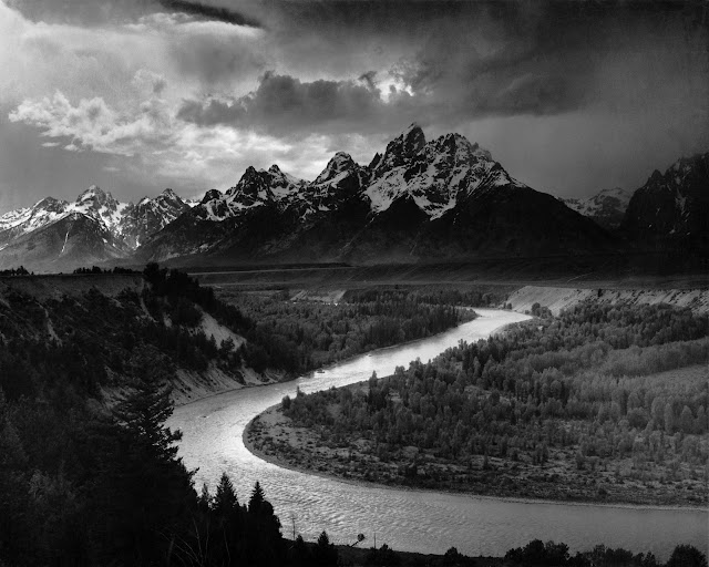
Ansel Adams, The Tetons and the Snake River (1942) Grand Teton National Park, Wyoming. National Archives and Records Administration, Records of the National Park Service. (79-AAG-1) [source]
I see two problems.
One is the desire to “fill Ansel Adams’ tripod holes.” This desire to duplicate that one Great Photograph is often present with ardent photographers who are more than beginners, who may be somewhat knowledgeable, but who may take a dilettantish view of the subject. While perhaps this is a worthy exercise for some, it leads to a repetition of photographs of the same subject from the same location, and so can turn an awesome subject into something dull or overly familiar. Typical landscape subjects, duplicated extensively, include Adams’ Half Dome, and photos of Delicate Arch and Mount Fuji, and we can include numerous other tourist attractions, such as the Gateway Arch.
But this trivializes the effort of the original photographer; Adams’ image of Half Dome is much more than simply location and subject, for time of day and year, and the weather were important, as well as his extensive darkroom work.
This attitude also leaves out room for improvement. Perhaps Adams was tired, and placed his tripod simply because his feet hurt, it was getting late in the day, and he didn’t want to walk any further. Perhaps there is a much better location which will never be discovered because of Adams’ precedent. We also have new technology, barely dreamed of in those days. What are the possibilities today?
But you should ask yourself: why spend the money, time, and trouble to travel to Yosemite Valley? Aren’t there worthy subjects close to home? If you are being paid to travel to remote locales, then certainly you can explore the world photographically. But in general, if you want to be a good landscape photographer, you have to take lots of photos of landscapes, and you can’t expect to pack all of your experience into a two-week vacation. Are there undiscovered landscapes near your home, ones that are destined to be featured in a future Great Photograph? Perhaps you can photograph what you know and love — perhaps, by being a local, you can see some detail that all the tourists miss. Never forget that what is commonplace to you is exotic and unusual to most of humanity.

I live not too far from Forest 44 Conservation Area, which is near Valley Park, Missouri; I’ve long thought that some good landscape photography can be had here, and am willing to keep trying to get the good shot.
I used the example of Ansel Adams (1902-1984) here simply because he is the only photographer that most people know by name, and because beginners will often say that they are inspired by his work. But there are many other great photographs and great photographers (and let’s not forget about painting) — perhaps we ought to do research and broaden our horizons in finding inspiration. Click here for a list of notable photographers. Click here to find notable painters.
Another problem is similar: people want to use the same gear used by the Great Photographer. “Did Adams shoot Canon or Nikon?” people actually ask. Clearly this can become a great expense, and can be fruitless and counterproductive if you don’t know how to use your gear for best effect. I mainly shot St. Louis Parks with what is now a rather antiquated digital camera with ordinary optics, and I’ve already completed the principal photography for my next two books with the same equipment: “But,” I say to myself, “my next projects will be taken with a Nikon D800E. I also need to upgrade my lenses.” Yes, an upgrade would be very nice, but my results are certainly adequate for my present needs. Maybe I’m pushing the limit of optical quality (especially on two-page spreads), and maybe a D5100 (much cheaper than the D800E) is more in line with what I really need. But chasing gear — even by a professional — can turn photography into an expensive collectors’ hobby, and perhaps the money can be more wisely spent.

This photo from the book gets lots of positive comments. I took it with a cheap point-and-shoot camera that you can buy used for about $200. These trees would have made an ordinary snapshot if not for the late afternoon light.
There are a few things that I’ve learned from studying highly-regarded landscapes, both paintings and photos, and nearly all the best landscapes have these things in common:
As I mentioned, while a lofty target can be a great inspiration, you have to examine yourself and understand your limits and your capabilities. If you are 5 foot tall or 55 years old, a dream of becoming a professional basketball player is unrealistic; it is even unrealistic for the vast majority of prime, top-rated young athletes. Don’t have extraordinary expectations unless you have a reason for your hope. Perhaps there is something else you can do well? What are your talents?

It was not my intention to set the focus on the branches seen here on the right, but that is what my camera’s automatic focus selected. That camera was nearly impossible to manually focus. My current camera (and many DSLRs) aren’t too good for manual focus, which is a shame.
Taking this bottom-up approach means that you first have to understand your gear and the basic principles of photography — dull things, perhaps, far removed from what many people call Art — but you can’t take a photograph unless you have a camera, and you usually can’t take a good photograph unless you know how to use your camera.
However, I recommend that a beginner take a multi-pronged approach to photographic technique, working on improving in parallel the choice of subject, camera settings, composition, and general appeal.

This is a particularly bad photo, taken under dull skies, with a huge pile of dirt on the right, a number of barely visible barges, and lots of dark muddy detail in the middle. What is the subject of this photo? What did I want to depict? If I wanted to depict a pile of dirt, why did I not depict it boldly and purposefully? Or why didn’t I zoom in to the barges? Or, rather, should I leave my camera home when the skies are overcast and uninteresting? Also, I might add that digital cameras often render shadows poorly, as seen here, making post processing or supplemental lighting almost a requirement for good photography.

My publisher considered using this photo. While the stray grasses at center bottom are distracting, and the trees are in the way, this photo still has a good subject with human interest. I specifically zoomed in to get one major subject, the boat, and the two onlookers on the left and right, without huge expanses of uninteresting detail. Not great, but it is an improvement over the previous photo.
Far more interesting (despite the tree branches) is the following photograph of tugboats, also on the Mississippi River:

But since this photo was not taken from one of my assigned parks, it could not go into the book.
Here are some mistakes that you ought to avoid:

I was provided with a list of parks to photograph. Sometimes, an assigned park would be only a rectangle of grass, perhaps surround by a fence. How can I take an appealing photograph of that? But I had a job to do. Driving around this park, I saw something in this row of bushes, it caught my eye, although this photo was disappointing.
My camera’s automatic white balance feature subtracted out the color of the sun, low in the sky. Like photos taken by most digital cameras, both highlight and shadow detail are flattened and dull. This required more than good camera work, instead, I had to bring out this detail in post processing.

Here the color of the sky is restored, and we can see texture there, as well as in the snow with its distinct animal tracks. We can even see some texture in the dark bushes, and the chain link mesh of the fence is more distinct. With cropping, we have a composed row of four bushes that harmonize with the fence. I knew that there was an interesting photo to be found here.

Saint Louis gets snow frequently in winter, but it typically does not get deep and it melts quickly. One night, snowfall was heavy and I stayed out until 4 in the morning taking photos to document the unusual weather. The light in the city was an orange color due to street lighting reflecting off the large falling flakes, and it was so bright that I was able to hand-hold the camera easily. I liked this bridge, and even took nine photos of it from this position, but the photos are slightly disappointing. A different camera position improves the subject:

Railroad tracks — and footprints — lead into the distance, while the bridge acts as a frame for another bridge. While many Saint Louisians are familiar with this park, undoubtably some have seen this bridge from this angle, but not under these weather conditions. A possibly ordinary subject becomes interesting.
A number of photos from that night made it into the book, because the color was so strong and the weather and time of day so unusual. That night made common things uncommon.
Generally speaking, the best landscape photographers are willing to get wet, muddy, and hike the extra mile in order to get their shot, which is something that I try to remind myself when I’d rather be at home in the air-conditioning, sitting in front of my computer.
Taking numerous shots of the same subject, and examining their strengths and flaws, can improve your photography:

Here we have the same scene as found on the book cover. I’ve taken many photos of it over time, and another view of this taken at night found its way into the book. Here I attempted to align the fountain precisely with building in the background, but I didn’t bother to keep the camera horizontal. The image is underexposed, even though that particular camera has little dynamic range to spare.
Note that I took it with a wide angle lens. Many beginning landscape photographers think that they need a wide, or ultra wide angle lens, in order to ‘get the whole scene in,’ and undoubtedly I thought that I needed to set the zoom to wide for the same reason. But look at how much of the image is featureless! The sky and the water here add nothing to the photo, it is inessential detail, as is much of the green grass. For this reason, it is commonly advised that you ought to ‘fill the frame’ with your subject — get close with either your zoom or your feet. (I might add that you probably ought to leave a little room around your subject for cropping.)
Please compare the relative sizes of the building and waterfall in both images. The cover photo was taken from a greater distance with a telephoto lens, and so the building and waterfall appear to be closer together; because the angle of view of the lens is smaller, we have less inessential detail of the sky, grass, and water. In the cover photo, the narrow strip of water serves to frame the main subject and act as a transition to the edge of the cover, while the relatively featureless sky is not wasted space, for in it we find the names of the authors.
Finally, notice that the two figures on the right are walking away from the fountain, and contrast that with the youth on the book cover, who appear to be enjoying the fountain. The eye is drawn towards humans, and if the humans in the photo appear to be uninterested in the scene, what does that tell you about your subject? I’ve seen some excellent landscapes where we are shown a human figure, looking at the scene with the same awe that the photographer or painter would want us to feel.
I had taken many photos of that waterfall over a period of time, and many of those photos were taken with considerable care and scene analysis. But on the day I was taking the cover photo, which was a Thursday, I undoubtably was busy doing other things, and I wasn’t out taking photos, but I did have my camera with me. As I approached the waterfall, I noticed the youth at play, and thinking that this was interesting, I took three photos as I was getting close. I knew I would have the right shot when I was centered on the waterfall: I took that final photo and then left. Within less than three minutes, without much forethought, with little setup, with just one photo, and under non-optimal conditions, I got the prime shot. I knew that it would be good. Experience helps.
Here is a particularly bad example:

These old ruins are an interesting subject, but this photo is typically of innumerable bad landscape photos. What does my photo show? Clearly, there are the remains of some sort of structure here, but the vegetation and especially the dappled lighting makes this a confusing and unsatisfactory image.
I usually find overcast days poor for landscapes, but the diffuse sky lighting might be a benefit here. Zooming in towards the door to the cave might also help isolate an interesting subject. Also, lack of vegetation in the wintertime might benefit by decluttering the scene.
I’m mainly an architectural photographer, and I usually find people in my photos to be a distraction from the purity of the form of the building. But armed with this attitude, the results of my first day of shooting were dismal:

From then on, I attempted to include people whenever possible:

This was taken near sunset, and the park was illumined by huge clouds in the sky, reflecting orange light from the setting sun. More photos from that evening can be seen here. I like those photos for several reasons, including the color of the light, the attractiveness of the park architecture, and the presence of people, waterfowl, and flowers. I also used camera work, I think, to good advantage — I shot these with a telephoto lens at wide aperture, and fixed the camera white balance to Daylight so as to retain the color of the lighting. This particular photo has a number of flaws, and I think the tree in the middle foreground is unfortunate, although the scene is still somewhat interesting.
It’s far too easy to take a dull photo:

Dull, dull, dull. Being bored is not only a waste of time, it can also be dangerous.
Dull photographs are often weak in texture and color. For this reason, many photographers tend to oversaturate their photographs, boosting the color beyond what is reasonable. I have mixed thoughts about this practice; for sure, digital images lack the contrast, texture, and color range found in real life, and so increased saturation is a legitimate technique to counteract the limits of the medium. Art purchasers also seem to prefer some level of increased saturation. On the other hand, this can harm texture as the medium is driven to the edge of its color gamut, and turn an otherwise plausible landscape into something that looks fake, or some would say dishonest.
Alternatively, you can select subjects that are inherently colorful:


The blue water here caught my eye. But a white sandy beach, in the Saint Louis area? I never thought there would be such a thing nearby. Interesting, unique landscapes are not necessarily far from home. According to Flickr, there are currently only about 100 photos taken at this park, and so it is barely discovered photographically.
The color of light, rather than merely the color of a subject can make an image appealing, and for this reason, many photographers avoid mid-day. Sunrise and sunset give a natural warm glow to an image, while dusk and dawn give a cool color. Please recall that highly-rated landscape photos are largely taken during these times of day. I am not saying that you can’t take an awesome shot at midday, I’m just saying that most excellent landscape photographs are not taken during that time of day.

Automatic white balance in a digital camera attempts to subtract out the color of light, with the goal of leaving neutrally-colored subjects in real life appearing to be neutral in the captured image. For example, a white piece of paper typically reflects light of all frequencies uniformly, and in a white balanced image, the red, green, and blue channels recording the white paper will all have the same value, which shows us that the color of the light was eliminated.
But sometimes we don’t want to subtract out the color of light. Many photographers, including me, will set the camera to a fixed ‘Daylight’ white balance when shooting at sunrise and sunset. This keeps a good balance between the orange color of the waning sun, and the deep blue of the sky, without neutralizing either color, and so makes the final image particularly colorful.

Besides the color shown here, I attempted to make this subject, a bench in floodwater, more interesting by composing it precisely within the frame. Order, proportion, harmony, and symmetry in the arts are often considered to be pleasing and interesting. Disorder and disharmony in the composition of a photo can lead to rejection and anxiety in a viewer.


I took a number of photos of this park, and the results were always poor, but dusk made the scene more colorful, and I think, more interesting.
A brightly colored photo is appealing, since color attracts attention and color has long been considered a component of beauty. But some people think that unusually or implausibly colored shots are manipulative, garish, or pandering to baser instincts, or are somewhat lacking in true art. For example, someone told me that they disliked my balloon photo above because it was too ’typical’ of an easy, appealing photo. See the article, The Red Shirt School of Photography, which should not be confused with another kind of Red Shirt.
We don’t need bright color to produce an interesting landscape image. See the article How the Wild West REALLY looked: Gorgeous sepia-tinted pictures show the landscape as it was charted for the very first time. These 19th century images show good subjects, good composition, good camera work, and often show human interest, but these images are all monochrome, and yet they are quite effective.
While adding saturation to an image may be questionable or even controversial, artificially adding sharpness to a digital image is almost always needed to produce a better final image. Similarly, local contrast enhancement is often an improvement. Cameras don’t see as the human eye sees, and we often have to make image corrections. Sharpening can be easily overdone, making a photo look rough; undersharpening, on the other hand, will look less than prime.

This shows the same image, using different resizing algorithms. The first is softer than the second, and I think it is less interesting because of that. Please note that there is a quality of blur than can differ between images, and photographers highly value those lenses known for good blur. However, in the digital age, we also need to take into consideration the varying quality of resizing and sharpening algorithms. A quality high-resolution image, properly resized, will look generally look better than a similar image of the same size taken with a lower resolution camera.

It helps to look at your successful photos — those that you and other people like — and attempt to determine why they may be successful. This image is popular. I think that the quality of the light here, and the color of the foliage, helps strengthen it.
Depending on where you live in the world, seasonal changes may help make landscape photographs more interesting. Here we see the trees leaves changing color and some flowers in the foreground. Normally, overcast skies are inferior for landscapes, but here we have good lighting over most of the scene, and the color of the fall foliage makes the scene more interesting. Because of the soft lighting, I was also able to bring up lots of significant detail in the main subject, the statue, and not lose too much texture in the shadows. I think I was fortunate in that the bronze color of the statue was significantly distinct from its background.
Consider an image taken here in summer under broad daylight — would a uniform mass of dark green tree leaves in the background help or harm it? What about the harsh lighting of midday? Or how about in winter — would bare tree branches add anything positive to the image? Or, was this image taken under fortunate conditions?

I hand-held the camera while taking this image of an island in a river; the scene was illumined by the light of a half-moon obscured by clouds, and underexposed by five stops. Only about two digital bits of usable tonality are left in this image, giving us a severely abstracted representation of the original scene. This might be suitable for exhibit in an avant-garde gallery, since it comes very close to the limits of photography, and is almost a pure exercise in form and shadow. It is not, however, a pretty landscape photo.
Imagine if the Superbowl were to be stripped of all inessential elements such as the flashy advertising and elaborate half-time show, and was only a well-played football game. True football fans would perhaps prefer this kind of less-distracting, more focused kind of a game. Likewise, many in the art world more appreciate a photograph that cuts distractions to a minimum, a photograph that gets to the core of photography and the subject. The general public may beg to differ, for the Superbowl also has a social aspect, and so we usually have a disconnect between the desires of experts and the wider population, in sports and in the arts. For example, if you visit the Grand Canyon with your family, you most certainly ought to photograph your kids in front of the canyon, for the sake of the family album, but don’t expect that to appeal to fine arts professionals.
The English word ‘abstract’ comes from the Latin ‘abstractus,’ meaning “drawn away,” and so that word usually means is a taking away of details. One photograph that is more abstract than the other will have less detail than the one that is less abstract. In my opinion, because of how human perception and memory works, I think that a certain level of abstraction is essential in quality photography. Of course, every photograph draws a lot away from the original subject, but I think that even more abstraction than a typical snapshot is necessary to have a good final image.
Herein lies a paradox. Image quality is usually preferred. Most viewers of two otherwise identical photographs will prefer the one that has higher image quality. But most viewers will also prefer an image that has less inessential detail than another. In one study of thousands of photographic portraits, test subjects, on average, rated images with narrow depth of field higher than those with deep depth of field — that is, they rated the more abstract images much higher than those which were less abstract. High quality is appreciated, but having a more abstract final image is also appreciated.

Here is roughly the same scene as above, but taken with more care. This is certainly more suitable for a popular photo book, but notice how there is more distracting detail, such as the leaves on the right and the logs in the center. I think a superior image would eliminate these details, and zoom in a bit closer to the main channel of the watercourse. I have a number of images of this spot taken at midday, but they are hardly notable.

I thought that this image of a forest path would be interesting, but it turned out disappointing. We have a nice winding path, but the tree trunks and branches have little order and so are confusing.

This visually similar photo of a river gets far more notice. The texture on the leaves is complex, but is more uniform than in the previous photo. This photo is simpler than the previous one. One flaw, however, is the dam near the top of the stream, which breaks the visual flow of the image.
The size of an image, its resolution, and the distance from which the image is viewed is important. Many photographers who intend to show their photos primarily on the Internet will produce images that are significantly simpler than those who sell large, high resolution prints. Significant, eye-catching detail on a large print can be much smaller than what can be seen on a thumbnail image. Very large prints are a trend in high-end fine arts photography, and these huge prints — often yards wide — tend to have an extreme amount of detail. Larger, more detailed images can have a more complex composition, since the viewer will visually subdivide the image into smaller compositions — and the task for the photographer is to make these smaller compositions harmonize with each other.
The final book, St. Louis Parks, turned out well, and it is well-recieved by the public. Please click here if you would like to purchase a copy, autographed by me.
My publisher selected the photo above for the cover of the book, and I generally like it. It isn’t perfect — the sky appears to have a slight greenish tone, especially when seen under fluorescent illumination (although it is correctly white-balanced, and I didn’t alter the hue in post-processing), and the image is a bit darker than I’d like. The formal symmetry, with the fountain and building centered with each other and with the frame, is pleasing to me, but it is slightly off — although this is offset by the presence of the spine, not seen here, on the left hand of the book. What makes the photo, I think, is the presence of teenagers enjoying the fountain; having human subjects in a landscape photo is often appealing. The photo is technically OK, has a good subject, and is composed adequately, making it, in the opinion of my publisher, good enough to be on the cover of a book.
Generally speaking, there is a certain lightness of spirit or relief you can get when you leave certain decisions to others — were I to have selected the photos for the book, I think I would have agonized too much over them, seeing little else than flaws. Instead, my publisher selected images that he thought had general appeal, and he usually selected my favorites. Artists are often not the best judges of their works. Getting a sense of what is good takes understanding, time, and experience, as well as receiving the good judgement of others.
The first step towards getting better in photography, or any art, I think, is to understand why your works are disappointing, and understanding what makes good images superior. This can be exceptionally difficult, for oftentimes it is hard to put vague feelings into words. Determining what actions to take can be difficult also, for it requires an understanding of the technology. For example, you may find that your photographs are too yellow, but you have to understand color theory in order to know that you must make the photos more blue to cancel out the yellow, and you have to understand manual white balance on the camera, or the use of post-processing on the computer to correct for this flaw.
A Lofty Target
It is easy to become inspired by awesome works of art, which can give you the desire to be able to do the same. When I started work on this project, I examined many highly-regarded landscape photos — and landscape paintings — and sought out good advice. What do the best landscape photographers do? How can I do the same?
Click here for some highly-rated images. Do you find those images good? If so, what in your opinion makes them good? If you don’t like them, what landscape photos do you find appealing? Why?
This kind of inspiration is a pull from above, and so serves as a worthy goal. But it can be simultaneously fruitless and discouraging if you don’t have the right attitude. If your target is so lofty, and you never come even close to hitting the target, do you want to give up?

Ansel Adams, The Tetons and the Snake River (1942) Grand Teton National Park, Wyoming. National Archives and Records Administration, Records of the National Park Service. (79-AAG-1) [source]
I see two problems.
One is the desire to “fill Ansel Adams’ tripod holes.” This desire to duplicate that one Great Photograph is often present with ardent photographers who are more than beginners, who may be somewhat knowledgeable, but who may take a dilettantish view of the subject. While perhaps this is a worthy exercise for some, it leads to a repetition of photographs of the same subject from the same location, and so can turn an awesome subject into something dull or overly familiar. Typical landscape subjects, duplicated extensively, include Adams’ Half Dome, and photos of Delicate Arch and Mount Fuji, and we can include numerous other tourist attractions, such as the Gateway Arch.
But this trivializes the effort of the original photographer; Adams’ image of Half Dome is much more than simply location and subject, for time of day and year, and the weather were important, as well as his extensive darkroom work.
This attitude also leaves out room for improvement. Perhaps Adams was tired, and placed his tripod simply because his feet hurt, it was getting late in the day, and he didn’t want to walk any further. Perhaps there is a much better location which will never be discovered because of Adams’ precedent. We also have new technology, barely dreamed of in those days. What are the possibilities today?
But you should ask yourself: why spend the money, time, and trouble to travel to Yosemite Valley? Aren’t there worthy subjects close to home? If you are being paid to travel to remote locales, then certainly you can explore the world photographically. But in general, if you want to be a good landscape photographer, you have to take lots of photos of landscapes, and you can’t expect to pack all of your experience into a two-week vacation. Are there undiscovered landscapes near your home, ones that are destined to be featured in a future Great Photograph? Perhaps you can photograph what you know and love — perhaps, by being a local, you can see some detail that all the tourists miss. Never forget that what is commonplace to you is exotic and unusual to most of humanity.
I live not too far from Forest 44 Conservation Area, which is near Valley Park, Missouri; I’ve long thought that some good landscape photography can be had here, and am willing to keep trying to get the good shot.
I used the example of Ansel Adams (1902-1984) here simply because he is the only photographer that most people know by name, and because beginners will often say that they are inspired by his work. But there are many other great photographs and great photographers (and let’s not forget about painting) — perhaps we ought to do research and broaden our horizons in finding inspiration. Click here for a list of notable photographers. Click here to find notable painters.
Another problem is similar: people want to use the same gear used by the Great Photographer. “Did Adams shoot Canon or Nikon?” people actually ask. Clearly this can become a great expense, and can be fruitless and counterproductive if you don’t know how to use your gear for best effect. I mainly shot St. Louis Parks with what is now a rather antiquated digital camera with ordinary optics, and I’ve already completed the principal photography for my next two books with the same equipment: “But,” I say to myself, “my next projects will be taken with a Nikon D800E. I also need to upgrade my lenses.” Yes, an upgrade would be very nice, but my results are certainly adequate for my present needs. Maybe I’m pushing the limit of optical quality (especially on two-page spreads), and maybe a D5100 (much cheaper than the D800E) is more in line with what I really need. But chasing gear — even by a professional — can turn photography into an expensive collectors’ hobby, and perhaps the money can be more wisely spent.
This photo from the book gets lots of positive comments. I took it with a cheap point-and-shoot camera that you can buy used for about $200. These trees would have made an ordinary snapshot if not for the late afternoon light.
There are a few things that I’ve learned from studying highly-regarded landscapes, both paintings and photos, and nearly all the best landscapes have these things in common:
- A good landscape is either of an epic subject, or it is of a beautiful subject, or both.
- Ordinary landscapes can be good if there is significant use of unusual camera work, such as good use of a wide angle lens, effective supplemental lighting, an unusual camera position, or other uncommon things of interest.
- Good landscapes are taken around sunset or sunrise, and sometimes at night, and almost never during midday.
- Good landscapes often depict unusual weather, such fog or snow, or impressive clouds, or dramatic lighting.
- Monochrome landscapes typically have a full range of tonalities; color landscapes typically have distinctive color, at least in detail.
- A good landscapes has an essential unity, a clear subject, and the composition harmonizes well with the subject, enhancing and directing attention towards it. Good landscapes are considerably more abstract than ordinary snapshots.
- Including a human in the image can transform the meaning and impression of the image dramatically, often for the better.
- Good landscapes are almost always made with good equipment and good technique. Rarely do you see a good landscape with obvious technical mistakes or bad image quality, as you will often see with excellent photojournalistic images.
As I mentioned, while a lofty target can be a great inspiration, you have to examine yourself and understand your limits and your capabilities. If you are 5 foot tall or 55 years old, a dream of becoming a professional basketball player is unrealistic; it is even unrealistic for the vast majority of prime, top-rated young athletes. Don’t have extraordinary expectations unless you have a reason for your hope. Perhaps there is something else you can do well? What are your talents?
Please see the article A Good Photograph for additional lofty meditations.
Flee from Evil
As I mentioned, finding inspiration in the best work done by the masters is important, but can be discouraging, since the target is so high. Another, perhaps easier, approach is to identify errors or problems in your photos, and then learn how to eliminate them. Avoiding bad photography is a push from below, and has the advantage of being easy to learn. Some dislike this negative approach, full of “thou shalt nots,” but it helps if we both can identify the good and how to avoid evil.It was not my intention to set the focus on the branches seen here on the right, but that is what my camera’s automatic focus selected. That camera was nearly impossible to manually focus. My current camera (and many DSLRs) aren’t too good for manual focus, which is a shame.
Taking this bottom-up approach means that you first have to understand your gear and the basic principles of photography — dull things, perhaps, far removed from what many people call Art — but you can’t take a photograph unless you have a camera, and you usually can’t take a good photograph unless you know how to use your camera.
However, I recommend that a beginner take a multi-pronged approach to photographic technique, working on improving in parallel the choice of subject, camera settings, composition, and general appeal.
This is a particularly bad photo, taken under dull skies, with a huge pile of dirt on the right, a number of barely visible barges, and lots of dark muddy detail in the middle. What is the subject of this photo? What did I want to depict? If I wanted to depict a pile of dirt, why did I not depict it boldly and purposefully? Or why didn’t I zoom in to the barges? Or, rather, should I leave my camera home when the skies are overcast and uninteresting? Also, I might add that digital cameras often render shadows poorly, as seen here, making post processing or supplemental lighting almost a requirement for good photography.
My publisher considered using this photo. While the stray grasses at center bottom are distracting, and the trees are in the way, this photo still has a good subject with human interest. I specifically zoomed in to get one major subject, the boat, and the two onlookers on the left and right, without huge expanses of uninteresting detail. Not great, but it is an improvement over the previous photo.
Far more interesting (despite the tree branches) is the following photograph of tugboats, also on the Mississippi River:
But since this photo was not taken from one of my assigned parks, it could not go into the book.
Here are some mistakes that you ought to avoid:
- Bad focus. Be sure you focus on your subject. Automatic focus will often select the closest object, which will often make a distant object blurry. For landscapes, you can hardly go wrong if you focus on the most distant significant detail and use a good aperture. Be aware that the larger the sensor on your camera, the larger the chance that you will have bad focus because of narrowed depth of field.
- No clear subject. What, specifically, is important in your photo? What catches your attention in the scene? What is distracting? Are you sure that your photograph will capture the scene in a way that will show the interesting subject clearly?
- Using a wide angle lens to ‘get the whole scene.’ Is the whole scene interesting? Be aware that a wide angle lens will make distant detail look smaller, while emphasizing the foreground: is this what you want? Ultra wide angle lenses will distort the edges; do you intend that?
- Bad framing. How much sky is in your photo? Is the sky interesting? Does too much space surround your subject? Will getting closer, or using a telephoto lens help? Is your subject nicely placed within the frame? Does your camera position and framing harmonize with the symmetry of the subject?
- Clutter. Tree trunks and branches, randomly scattered across your image, can detract from your photo of a forest. Rather, seek out scenes that are simpler, cleaner, more ordered, and more uniform. A certain amount of abstraction will often make a better image.
- Softness. Landscapes are usually enhanced with crisp detail. Softness due to poor optics or technique is often disappointing.
- Bad exposure. Is significant detail lost because of over or underexposure? Be aware that having even one of the three color channels overexposed will cause a shift in color. See the article Three Opportunities for Overexposure for details. Better lighting, high dynamic range techniques, or significant post-processing on the computer may be needed to correct for this.
- A tilted camera. Do you intend the horizon line to be crooked? With wide angle lenses, be aware that there may be a significant perspective distortion on vertical lines if the camera is not held level.
- Bad white balance. Most cameras do a good job when taking photos in broad daylight, but photos in the shade may turn out blue, or photos at sunset may have a disappointing lack of golden color. Be aware of the limits of automatic white balance, and override the function manually to get the right color. See the article White Balance, Part 1 for more details.
- Bad color. Are the colors captured by the camera dull and lifeless? If so, would your image look good in monochrome? Either post-processing, choosing a better time of day, or a more interesting weather condition may help.
- Bad lighting. Do shadows enhance your subject, or do they distract from it? Does the soft uniform lighting from an overcast sky improve your image, or does the white featureless sky distract from it? Does dappled sunlight enhance your image, or does it make the scene unintelligible?
- Shooting into the sun. Do you intend to have lens flare and other optical artifacts in your image? Do you intend to have a black, featureless foreground, or an overexposed sky?
- Not knowing your limitations. Most cameras at this time do not have good low-light performance: taking a photograph at dusk, without a tripod, may give you photos that have excessive noise or blur due to camera shake. Does your knowledge of theory outstrip your experience, leading to misguided photographic choices? Is your theoretical knowledge weak, leading you to have a borderline superstitious understanding of your camera? Are you seeking outside help to improve your photography? Do you shoot with a friend or with a group? Do you seek critique of your photos?
- Chasing gear. Do you think that better camera gear will automatically get you better photos without any effort on your part? Is there a better use for your money? Squeezing the last bit of quality from inferior camera equipment can be an excellent experience, and not just a frustration.
- Laziness. Do you intend to take superior photographs, but aren’t willing to make an extra effort to get them? Are you willing to get up earlier than is customary for you? Are you willing to wait until the lighting is better? Are you willing to be somewhat uncomfortable when finding a better place to take a photograph?
- Not knowing your audience. Are you shooting for a family album, for a popular book, or for a curated art gallery? Your images may vary depending on your audience expectations.
Keeping these mistakes in mind can help you become a better photographer. But many of these things can be a good choice if you know that it will make for a superior photograph. Ultimately, it is the wisdom that comes from knowledge, experience, and inspiration that will help.
Some Examples
I was provided with a list of parks to photograph. Sometimes, an assigned park would be only a rectangle of grass, perhaps surround by a fence. How can I take an appealing photograph of that? But I had a job to do. Driving around this park, I saw something in this row of bushes, it caught my eye, although this photo was disappointing.
My camera’s automatic white balance feature subtracted out the color of the sun, low in the sky. Like photos taken by most digital cameras, both highlight and shadow detail are flattened and dull. This required more than good camera work, instead, I had to bring out this detail in post processing.
Here the color of the sky is restored, and we can see texture there, as well as in the snow with its distinct animal tracks. We can even see some texture in the dark bushes, and the chain link mesh of the fence is more distinct. With cropping, we have a composed row of four bushes that harmonize with the fence. I knew that there was an interesting photo to be found here.
Saint Louis gets snow frequently in winter, but it typically does not get deep and it melts quickly. One night, snowfall was heavy and I stayed out until 4 in the morning taking photos to document the unusual weather. The light in the city was an orange color due to street lighting reflecting off the large falling flakes, and it was so bright that I was able to hand-hold the camera easily. I liked this bridge, and even took nine photos of it from this position, but the photos are slightly disappointing. A different camera position improves the subject:
Railroad tracks — and footprints — lead into the distance, while the bridge acts as a frame for another bridge. While many Saint Louisians are familiar with this park, undoubtably some have seen this bridge from this angle, but not under these weather conditions. A possibly ordinary subject becomes interesting.
A number of photos from that night made it into the book, because the color was so strong and the weather and time of day so unusual. That night made common things uncommon.
Generally speaking, the best landscape photographers are willing to get wet, muddy, and hike the extra mile in order to get their shot, which is something that I try to remind myself when I’d rather be at home in the air-conditioning, sitting in front of my computer.
Taking numerous shots of the same subject, and examining their strengths and flaws, can improve your photography:
Here we have the same scene as found on the book cover. I’ve taken many photos of it over time, and another view of this taken at night found its way into the book. Here I attempted to align the fountain precisely with building in the background, but I didn’t bother to keep the camera horizontal. The image is underexposed, even though that particular camera has little dynamic range to spare.
Note that I took it with a wide angle lens. Many beginning landscape photographers think that they need a wide, or ultra wide angle lens, in order to ‘get the whole scene in,’ and undoubtedly I thought that I needed to set the zoom to wide for the same reason. But look at how much of the image is featureless! The sky and the water here add nothing to the photo, it is inessential detail, as is much of the green grass. For this reason, it is commonly advised that you ought to ‘fill the frame’ with your subject — get close with either your zoom or your feet. (I might add that you probably ought to leave a little room around your subject for cropping.)
Please compare the relative sizes of the building and waterfall in both images. The cover photo was taken from a greater distance with a telephoto lens, and so the building and waterfall appear to be closer together; because the angle of view of the lens is smaller, we have less inessential detail of the sky, grass, and water. In the cover photo, the narrow strip of water serves to frame the main subject and act as a transition to the edge of the cover, while the relatively featureless sky is not wasted space, for in it we find the names of the authors.
Finally, notice that the two figures on the right are walking away from the fountain, and contrast that with the youth on the book cover, who appear to be enjoying the fountain. The eye is drawn towards humans, and if the humans in the photo appear to be uninterested in the scene, what does that tell you about your subject? I’ve seen some excellent landscapes where we are shown a human figure, looking at the scene with the same awe that the photographer or painter would want us to feel.
I had taken many photos of that waterfall over a period of time, and many of those photos were taken with considerable care and scene analysis. But on the day I was taking the cover photo, which was a Thursday, I undoubtably was busy doing other things, and I wasn’t out taking photos, but I did have my camera with me. As I approached the waterfall, I noticed the youth at play, and thinking that this was interesting, I took three photos as I was getting close. I knew I would have the right shot when I was centered on the waterfall: I took that final photo and then left. Within less than three minutes, without much forethought, with little setup, with just one photo, and under non-optimal conditions, I got the prime shot. I knew that it would be good. Experience helps.
Here is a particularly bad example:
These old ruins are an interesting subject, but this photo is typically of innumerable bad landscape photos. What does my photo show? Clearly, there are the remains of some sort of structure here, but the vegetation and especially the dappled lighting makes this a confusing and unsatisfactory image.
I usually find overcast days poor for landscapes, but the diffuse sky lighting might be a benefit here. Zooming in towards the door to the cave might also help isolate an interesting subject. Also, lack of vegetation in the wintertime might benefit by decluttering the scene.
I’m mainly an architectural photographer, and I usually find people in my photos to be a distraction from the purity of the form of the building. But armed with this attitude, the results of my first day of shooting were dismal:
From then on, I attempted to include people whenever possible:
This was taken near sunset, and the park was illumined by huge clouds in the sky, reflecting orange light from the setting sun. More photos from that evening can be seen here. I like those photos for several reasons, including the color of the light, the attractiveness of the park architecture, and the presence of people, waterfowl, and flowers. I also used camera work, I think, to good advantage — I shot these with a telephoto lens at wide aperture, and fixed the camera white balance to Daylight so as to retain the color of the lighting. This particular photo has a number of flaws, and I think the tree in the middle foreground is unfortunate, although the scene is still somewhat interesting.
It’s far too easy to take a dull photo:
Dull, dull, dull. Being bored is not only a waste of time, it can also be dangerous.
Dull photographs are often weak in texture and color. For this reason, many photographers tend to oversaturate their photographs, boosting the color beyond what is reasonable. I have mixed thoughts about this practice; for sure, digital images lack the contrast, texture, and color range found in real life, and so increased saturation is a legitimate technique to counteract the limits of the medium. Art purchasers also seem to prefer some level of increased saturation. On the other hand, this can harm texture as the medium is driven to the edge of its color gamut, and turn an otherwise plausible landscape into something that looks fake, or some would say dishonest.
Alternatively, you can select subjects that are inherently colorful:
The blue water here caught my eye. But a white sandy beach, in the Saint Louis area? I never thought there would be such a thing nearby. Interesting, unique landscapes are not necessarily far from home. According to Flickr, there are currently only about 100 photos taken at this park, and so it is barely discovered photographically.
The color of light, rather than merely the color of a subject can make an image appealing, and for this reason, many photographers avoid mid-day. Sunrise and sunset give a natural warm glow to an image, while dusk and dawn give a cool color. Please recall that highly-rated landscape photos are largely taken during these times of day. I am not saying that you can’t take an awesome shot at midday, I’m just saying that most excellent landscape photographs are not taken during that time of day.
Automatic white balance in a digital camera attempts to subtract out the color of light, with the goal of leaving neutrally-colored subjects in real life appearing to be neutral in the captured image. For example, a white piece of paper typically reflects light of all frequencies uniformly, and in a white balanced image, the red, green, and blue channels recording the white paper will all have the same value, which shows us that the color of the light was eliminated.
But sometimes we don’t want to subtract out the color of light. Many photographers, including me, will set the camera to a fixed ‘Daylight’ white balance when shooting at sunrise and sunset. This keeps a good balance between the orange color of the waning sun, and the deep blue of the sky, without neutralizing either color, and so makes the final image particularly colorful.
Besides the color shown here, I attempted to make this subject, a bench in floodwater, more interesting by composing it precisely within the frame. Order, proportion, harmony, and symmetry in the arts are often considered to be pleasing and interesting. Disorder and disharmony in the composition of a photo can lead to rejection and anxiety in a viewer.
I took a number of photos of this park, and the results were always poor, but dusk made the scene more colorful, and I think, more interesting.
A brightly colored photo is appealing, since color attracts attention and color has long been considered a component of beauty. But some people think that unusually or implausibly colored shots are manipulative, garish, or pandering to baser instincts, or are somewhat lacking in true art. For example, someone told me that they disliked my balloon photo above because it was too ’typical’ of an easy, appealing photo. See the article, The Red Shirt School of Photography, which should not be confused with another kind of Red Shirt.
We don’t need bright color to produce an interesting landscape image. See the article How the Wild West REALLY looked: Gorgeous sepia-tinted pictures show the landscape as it was charted for the very first time. These 19th century images show good subjects, good composition, good camera work, and often show human interest, but these images are all monochrome, and yet they are quite effective.
While adding saturation to an image may be questionable or even controversial, artificially adding sharpness to a digital image is almost always needed to produce a better final image. Similarly, local contrast enhancement is often an improvement. Cameras don’t see as the human eye sees, and we often have to make image corrections. Sharpening can be easily overdone, making a photo look rough; undersharpening, on the other hand, will look less than prime.
This shows the same image, using different resizing algorithms. The first is softer than the second, and I think it is less interesting because of that. Please note that there is a quality of blur than can differ between images, and photographers highly value those lenses known for good blur. However, in the digital age, we also need to take into consideration the varying quality of resizing and sharpening algorithms. A quality high-resolution image, properly resized, will look generally look better than a similar image of the same size taken with a lower resolution camera.
It helps to look at your successful photos — those that you and other people like — and attempt to determine why they may be successful. This image is popular. I think that the quality of the light here, and the color of the foliage, helps strengthen it.
Depending on where you live in the world, seasonal changes may help make landscape photographs more interesting. Here we see the trees leaves changing color and some flowers in the foreground. Normally, overcast skies are inferior for landscapes, but here we have good lighting over most of the scene, and the color of the fall foliage makes the scene more interesting. Because of the soft lighting, I was also able to bring up lots of significant detail in the main subject, the statue, and not lose too much texture in the shadows. I think I was fortunate in that the bronze color of the statue was significantly distinct from its background.
Consider an image taken here in summer under broad daylight — would a uniform mass of dark green tree leaves in the background help or harm it? What about the harsh lighting of midday? Or how about in winter — would bare tree branches add anything positive to the image? Or, was this image taken under fortunate conditions?
I hand-held the camera while taking this image of an island in a river; the scene was illumined by the light of a half-moon obscured by clouds, and underexposed by five stops. Only about two digital bits of usable tonality are left in this image, giving us a severely abstracted representation of the original scene. This might be suitable for exhibit in an avant-garde gallery, since it comes very close to the limits of photography, and is almost a pure exercise in form and shadow. It is not, however, a pretty landscape photo.
Imagine if the Superbowl were to be stripped of all inessential elements such as the flashy advertising and elaborate half-time show, and was only a well-played football game. True football fans would perhaps prefer this kind of less-distracting, more focused kind of a game. Likewise, many in the art world more appreciate a photograph that cuts distractions to a minimum, a photograph that gets to the core of photography and the subject. The general public may beg to differ, for the Superbowl also has a social aspect, and so we usually have a disconnect between the desires of experts and the wider population, in sports and in the arts. For example, if you visit the Grand Canyon with your family, you most certainly ought to photograph your kids in front of the canyon, for the sake of the family album, but don’t expect that to appeal to fine arts professionals.
The English word ‘abstract’ comes from the Latin ‘abstractus,’ meaning “drawn away,” and so that word usually means is a taking away of details. One photograph that is more abstract than the other will have less detail than the one that is less abstract. In my opinion, because of how human perception and memory works, I think that a certain level of abstraction is essential in quality photography. Of course, every photograph draws a lot away from the original subject, but I think that even more abstraction than a typical snapshot is necessary to have a good final image.
Herein lies a paradox. Image quality is usually preferred. Most viewers of two otherwise identical photographs will prefer the one that has higher image quality. But most viewers will also prefer an image that has less inessential detail than another. In one study of thousands of photographic portraits, test subjects, on average, rated images with narrow depth of field higher than those with deep depth of field — that is, they rated the more abstract images much higher than those which were less abstract. High quality is appreciated, but having a more abstract final image is also appreciated.
Here is roughly the same scene as above, but taken with more care. This is certainly more suitable for a popular photo book, but notice how there is more distracting detail, such as the leaves on the right and the logs in the center. I think a superior image would eliminate these details, and zoom in a bit closer to the main channel of the watercourse. I have a number of images of this spot taken at midday, but they are hardly notable.
I thought that this image of a forest path would be interesting, but it turned out disappointing. We have a nice winding path, but the tree trunks and branches have little order and so are confusing.
This visually similar photo of a river gets far more notice. The texture on the leaves is complex, but is more uniform than in the previous photo. This photo is simpler than the previous one. One flaw, however, is the dam near the top of the stream, which breaks the visual flow of the image.
The size of an image, its resolution, and the distance from which the image is viewed is important. Many photographers who intend to show their photos primarily on the Internet will produce images that are significantly simpler than those who sell large, high resolution prints. Significant, eye-catching detail on a large print can be much smaller than what can be seen on a thumbnail image. Very large prints are a trend in high-end fine arts photography, and these huge prints — often yards wide — tend to have an extreme amount of detail. Larger, more detailed images can have a more complex composition, since the viewer will visually subdivide the image into smaller compositions — and the task for the photographer is to make these smaller compositions harmonize with each other.
Final Ideas
- Landscapes are not about you, for they are things in themselves, and so a landscape photo ought to clearly show what is true about the scene you are photographing. A heavily manipulated and composited image may be an interesting exercise in digital art, but it is not a landscape photo. If your intent is to show a mood or feelings, then more artifice is allowable, and necessary — your viewers ought to be given clues that your photo is not a natural landscape.
- Unlike many other forms of photography, landscapes do not suffer gimmicks or mistakes very well. Use good gear and technique, and get out of the way of the scene itself. Composition is likely to be difficult, so take your time in finding a good camera position.
- Landscapes are subtle, and photography tends to flatten out subtleties, which require us to shoot something extraordinary merely to make the image look normal. The final image ought to please, delight, or move your audience; if it does not, then the image is a failure.
See also the article Giving Credit...; thanks to my friend Tina, who has a good photographic eye and often suggests good camera positions, and who is very supportive.
Thursday, January 26
Composition, Part 1 - the Frame
I MUST ADMIT that the technical aspects of photography are easiest for me. Color spaces, exposure and lens calculations, f/stops, shutter speeds, and ISO sensitivity are generally objectively certain and quantifiable. On the contrary, artistic considerations such as the use of color itself and composition seem to be subjective, qualitative, and much less certain. However, we must not oppose technique with art: they are not two things, but are different aspects of one thing, and they both must be taken into consideration when making a final image.
When I became serious about photography a number of years ago, I didn't give composition too much consideration, simply due to the fact that I was taking mainly architectural photos:

Saint Francis Xavier Church, at Saint Louis University, in Saint Louis, Missouri, USA.
The hard work of composition was already done for me by the architect. I merely had to discover good camera positions and angles, and the kind of post processing that would express the work of the architect in a pleasing manner. Fortunately, these discoveries came rather quickly to me.
Likewise, I found it easy to take pleasing photos of flowers:

Flower, at the Missouri Botanical Garden (Shaw's Garden), in Saint Louis.
Flowers are intrinsically interesting, and nature suggests composition.
But I always had a problem with landscapes. So many times, I'd take some photo of a scene that I thought was interesting, but my end results were usually dull:

Bottomland forest, at Castlewood State Park, in Saint Louis County.
With my eyes, this scene pleased me enough that I took the time to set up my tripod, take a series of exposures, and then I spent significant time on the computer attempting to make this image look good. Now when I view this, I cannot imagine what I thought I saw when I was in the forest. This appears to be a waste of my time.
A while back, I was hired to photograph a book on the public parks in my city. This caused me no small amount of anxiety; now, my publisher must have thought that I was up to the task, and many of the photos were to be somewhat like this:

Bandstand, at Tower Grove Park, in Saint Louis.
As this is an architectural landscape, much of the composition was already done for me by the building and landscape architects, and with some judicious cropping, this ought to become a pleasing image. But what about a natural landscape?
Looking back at the dull forest photo above, I knew that something interesting must have been in that image, otherwise I would not have spent so much time on it. But why does this image fail to show this interest? I conclude that either the post-processing is wrong, or more likely, the composition of the final image is wrong.
I am not so naïve to believe that all I need to do is to learn rules of composition, which will automatically produce pleasing images. But neither am I satisfied the advice that I ought to simply adjust my image until it looks good to me. What if all my adjustments are unsatisfactory? Why are they not satisfactory? But I was in the forest, and what I saw from my camera position pleased me. How do I discover a pleasing composition in this image?
It is the goal of this blog to provide objective information on photography. In my very first article here, I wrote:
Please consider that nearly all photographs are rigidly bound by a fixed frame. For nearly all images, we can determine with high precision what precisely is a part of the photograph and what is not a part of it. All of the photographs above are rectangular, being at most 500 pixels wide. The fixed frame is therefore the basic element of composition, or at least is the most objective element. It is the most certain, most rigid, most obvious, most purely geometrical part of a photograph. The frame defines and bounds the photograph. Please note that I use the term ‘frame’ here to denote the outside edges of the photo, but picture frames also serve the important function of making a distinct, yet broad transition between the image and the wall.
Also note that all consumer digital cameras produce rectangular images. This is significant, but I won’t go into it further here.
[On the contrary, irregular cutouts are more ambiguous, as are feathered edges that fade to transparency. These effects are used at times, but largely in designs where a photograph is a part of a larger composition. Occasionally, an image element will break out of the frame, but this is typically used sparingly as a gimmick. But the frame is fixed for the vast majority of casual or serious photographs.]
OK, so the frame of an image has an undeniable influence over the content of an image. You may re-crop an image in a large number of ways, and every crop excludes a different part of the image. What are we to make of this? Here are some possible opinions:

The subject of Edvard Munch’s The Scream was driven insane by bad theories of art.
Regarding #2, why do you like any given crop? Do you know why, or does a good crop just feel good? According to ancient Greek philosopher Plato, “An unexamined life is not worth living.” How can you expect to grow in your art unless you can intellectually discern why you do one thing instead of another? I am not saying that this kind of discernment is easy, only that it is highly recommended in order to perfect art.

I cropped the photo this way because that’s the way I liked it. Certainly, I wanted to show the leaf margins on the right and bottom, but why did I leave as much room as I did? How did I determine the top and left crops? This photo was taken within the Climatron greenhouse at the Missouri Botanical Garden in Saint Louis.
In rule #2 is the notion that the artist only has to please himself. But what if an important client requests another crop, different from your preferred one? Would you rather starve than compromise your artistic vision? Is this a battle worth fighting for? Have you considered that your client may actually have a better artistic vision than you do? Why don’t you instead produce an image that is robust enough to survive a wide variety of crops?
#3 is often claimed that filling your cameras frame is the most efficient use of pixels, and certainly if your subject takes up more of your camera’s frame, then you will likely have better image quality. However, there are two limitations. First, very tight framing limits your cropping options, particularly if you have to make a standard size print that may not have the same aspect ratio as your camera. For example, my publisher often crops my images severely when my framing is too tight; better compositions may be had if I do looser framing. Second, the aspect ratio of your camera is likely not ideal for every subject: many photographers prefer an image taller than it is wide when doing portraits, and likewise produce an image wider than it is tall when doing landscapes. Square format is considered to be particularly powerful, but it would need to be cropped in these circumstances.

This is a very tight composition, and would not, to me, be satisfactory if recropped as an 8x10 image.
On #4, or the Golden Mean or Golden Ratio. First, it is generally understood that not all frame aspect ratios suit all images. When I’m taking photos of flowers that show some degree of radial symmetry, as seen in the flower image above, I often find that a square aspect ratio is pleasing for the subject. An aspect ratio of approximately 1.6180339887:1 can’t always be optimal.

An approximate golden rectangle; 500x309 pixels in size, giving an aspect ratio of about 1.618:1.
Furthermore, phi is an irrational number, and its decimal digits go on forever, and so that isn’t well suited for digital photography where we deal with discrete numbers of pixels. But this is a petty complaint. It is claimed that a golden rectangle has the most pleasing aspect ratio of all rectangles, but it is hard to find data that substantiates that claim, and anyway human eyes aren’t good at making precise measurements.
A practical consideration is that cropping your images to this aspect ratio makes printing and framing your prints more expensive and time-consuming.
It is claimed the golden mean has remote antiquity, and was used as an aesthetic number by the ancient Greeks. There is no evidence of this. Where the number is definitely found in antiquity, it was of mathematical use only, and only incidentally found in art, since phi does appear in some geometric constructions such as the pentagram and the Platonic solids. We can be pretty certain that phi, before the modern age, was never used directly as an aesthetic proportion.
You can find an extremely critical article against the golden ratio here.
By the way, the Greek philosophers did use the term ‘golden mean’ but only in discussions of virtue. According to the philosophers, a virtuous action is the ‘golden mean’ between two vices; for example, justice is the golden mean between leniency and severity, and courage is the mean between being a coward and being foolhardy.
#5 is practical advice. If you are selling prints, it is prudent to size and crop them to fit within one of the standard print sizes. Because frames and mattes are pre-cut to a series of fixed sizes, you can save much money and time by doing a standard crop.
But herein lies the problem. Who says that that standard print sizes are going to work with your images? Some compositions are very tight, and if you have a pattern of repeating elements in your image, a bad crop can make it look disharmonious. Also, you probably don’t want to crop out the top of the bride’s hair just to make it fit within an 8x10 inch print. Finally, putting a non-standard image size in a standard frame — where there are gaps outside of either the long or the short edges of the print — looks very unprofessional.

Pinkie, by Thomas Lawrence, badly framed.
Its quite frustrating, but many of the standard American and Japanese print sizes have different aspect ratios; so if you want to produce a small, medium, and large standard print, you have to crop them differently for each size. The three most standard print sizes, 4x6, 5x7, and 8x10 inches all have different aspect ratios, and so different crops are required. Supporting all of these print sizes means that you have to shoot loosely and compose your images so that no one of these three crops looks bad, which may be difficult to do well with some subjects.

Mona Lisa, cropped to the 8x10 inch aspect ratio. The original is approximately 3:2. I am pretty sure that Da Vinci neither put a code nor phi in this painting, and I am positive that an 8x10 crop doesn’t help it.
However, I might mention that any given standard print, matte, and frame combination is usually harmonious. These sizes aren’t arbitrary.
Contrary to the Japanese-American standard print sizes, the ISO 216 standard uses a fixed aspect ratio for all sizes. Different cropping isn’t needed for each size. But the aspect ratio is irrational, with the long size being the square root of 2 times the size of the short one (approximately 1.4142135623731:1). As with the suggestion that the golden mean be the aspect ratio (see #4), this may be misguided. This system gives no choice of aspect ratio in order to harmonize with the subject, nor has this ratio ever been widely considered to be aesthetically pleasing. In practice, the numbers for the paper sizes are rounded off to the nearest centimeter, with different manufacturers rounding off the numbers in various ways. By the way, the ISO 216 standard was designed so that the next size is half that of the one that came before it, so an A3 print is half the size of an A2 print. The standard includes an A, B, and C series, each having a different starting point so as to allow for a larger number of standard sizes, closer to each other.
The alternative to using standard sizes is to crop your images to whatever aspect ratio serves your composition. If you are making images for display on the Internet, there isn’t anything else you need to do besides resizing them.
If you are making a print, you can make a custom matte and frame to harmonize with it. Custom-cut frames and mattes are quite expensive in retail stores, and if you aren’t watching the person cutting them, and help them with the measurements, you might very well get the wrong sizes. Or you can do this yourself, if you are good with cutting tools, but still this isn’t cheap. Although some sort of framing is almost always needed for art prints, be aware that some fine art photography in the past was displayed without frames, tacked on cardboard. Whether or not your spouse or your client will buy this, however, is not for me to decide.

All Star game, in Saint Louis, in A.D. 2009. The 4:3 image at top is stretched to 16:9 on the bottom. Never, never, never, never do this.
Ah, the famous Rule of Thirds, rule #6. Is there any other rule of composition? This one gets repeated constantly. This rule states that main compositional elements ought to be placed one-third of the way between the edges of the photo. I wrote about that rule (see the article Rule of Thirds?), and I do sometimes use it, if I think it makes for a stronger composition.
Many folks say that this rule should be followed in all photos, but when someone claims that it doesn’t work, then they say “rules are meant to be broken”. Ugh. No no no no no. You do not tell a police officer, who is arresting you, that “rules are meant to be broken” nor do you tell that to the judge. You do not break the rules of gravity. Either it is a rule that has significant real consequences if it is broken, or it isn’t a rule at all.
Ancient proportional systems have very many “rules” but in such a wide variety that they aren't rules at all, but rather are harmonious design guidelines. Like painters’ color palettes, the musical scales, or poetic forms, you have a broad freedom to select whatever system that works for your composition. If you are really good, you can devise your own systems. Based on the classical harmonies, I could say that this or that composition follows the “rule of unities”, the “rule of halves”, the “rule of fifths”, the “rule of octaves”, the “rule of increments”, “the rule of inverses" and dozens or hundreds of other so-called rules. Adding harmony to your image is usually accepted as a way of improving it. What particular harmony to add to an image can be a problem.
Flooding on Smallpox Island, near Alton, Illinois. I explicitly used the Rule of Thirds here, as well as the Rule of Halves (which is a rule I made up). I got a number of positive compliments about this composition.
Rule #7: if you don’t follow the canons of proportion, your result will be bad. The Age of Enlightenment was also the Age of Science. Prominent scientists and philosophers determined that certain artistic rules were good for the visual arts, and so academia taught artists to follow these rules. This process was accepted in the 18th century and it is accepted today, although of course the rules are different. What was absurd was the claim that if art did not follow such rules, it couldn’t be good; also absurd would be the claim that any art that followed those rules must be necessarily be good. In juried competitions, excellent paintings were rejected only because they violated some unreasonable rule or another. Please remember that an unjust rule isn’t a rule at all.
While the state-sponsored academies were perhaps wrong in limiting artistic latitude so strongly, the opponents of these academies were wrong in claiming that there were no rules, that freedom must be total. One of the most absurd claims by the Impressionists was that composition of paintings was not necessary, because nature has her own composition. If this is true, then why is my forest photo above so bad? That there is an intrinsic order to nature cannot be denied, but this order usually exceeds human reason.
An example of these kinds of artistic rules can be found in the “Classical unities,” inspired by The Poetics by Aristotle; these rules state that a tragic play ought to have one plot, one location, and take place over the course of not much more than one day. But Aristotle himself, in the same book, didn’t say that his rules were inviolable; he simply said that the best tragic plays of his day conformed to some rules, and that certainly tragedy could be further improved.
As a general principle, never confuse “is” with “ought”. The great Gothic Revival theorist A.W.N. Pugin said that the Gothic is the greatest Christian style of architecture, worthy of imitation; he also said that some other style in the future could be even greater.
I reject this painting, The Oath of the Horatii, by Jacques-Louis David, because it invokes Godwin’s Law.
Unlike the Modernists, I see no problem with working within the old classical harmonies and canons of proportion. For example, Byzantine iconography has seen a great resurgence, and there are artists who are trying to recover the canons of Gothic painting. Photography is certainly an art form of the Modern period, but that does not limit me from appreciating art in the Western classical tradition, nor prevent me from incorporating these principles into my art.
Classical harmony, #8, is a topic near and dear to my heart. It is certain that many of the great architectural achievements of the past were explicitly constructed using these harmonies. David’s painting above depicts three arches made with harmonious proportion.
We have no evidence that the ancient Greeks or the Gothic cathedral builders used the golden mean as a proportional ratio, and the square root of two was used only as a consequence of that number being the diagonal of a unit square. Rather, we do know very well what kind of proportions in art were preferred by them: ratios of small whole integers. Derived from the musical experiments of Pythagorus and commented on by the philosophers Plato and Aristotle, the theory of numbers and their harmonic proportions was preserved and elaborated during the Medieval period, and served European civilization until Modernism. This number theory, coupled with the geometry of Euclid and his use of the compass and straightedge, led to some of the most awe-inspiring buildings in history. Classical harmony is also the foundation of music, and ought to be seriously considered by every artist.
See the article, Harmonious Proportion and Ratio, for an overview on the classical harmonies.
#9, the value and importance of the frame.
Let’s face it. Photography is an inferior medium. We do not have the great control over our subject as do painters or architects, and even if we use Photoshop to its fullest extent, we end up with digital art rather than photography. Now if I had a photo studio, perhaps I could compose my images precisely and harmoniously, but instead if I’m taking photos of landscapes, I have to take what I see and work from there. I simply cannot compose my images as well as I would like. Photography is a powerful medium, but composition is not one of its strengths. Ironically, much contemporary compositional theory was developed by photographers as they attempted to improve their medium.
There are some situations where framing can harmonize precisely with an image, for example, see the following photograph of metal panels, found at an exhibit at a car show:

The proportion of the sides of this image is 3:2, and this harmonizes with the regular metal pattern found in the image. If I didn’t keep the camera level, or if I cropped it contrary to the pattern in the metal, this would likely be a poorer image.
If your subject has a strong symmetries — like the church in the top photo above — then certainly do your best to conform the frame to the symmetry expressed in the subject. You are given a good subject, and so give it a good frame. Make the frame harmonize with the subject.
We are often told that “beauty is in the eye of the beholder,” that there is no artistic method that will lead to beauty. However, many of these theorists also praise works that are “jarring” and “subversive,” and so by implication there are principles of disharmony and ugliness that these artworks must obviously follow. What is certain, it is impossible to produce a work of art that follows no rules or principles at all. See the article “The Tropeless Tale” for a humorous refutation of this nihilism.
A problem with landscape photography is that we usually aren’t provided with regular patterns. While we do find these harmonic patterns in flowers, leaves, and animals, general landscapes have a logic that is likely indiscernible by the human intellect. So, in landscapes, what exactly is the frame harmonizing with? Do not forget, you always have a frame. Does the frame fit the subject? Quite a problem, but some landscape photographers seem to produce good compositions at alarming frequency.
Perhaps the very best landscape photographers select those subjects that they know will produce good photos, by intellectually analyzing the scene before them, and not allowing their instincts or baser passions to influence their decision to take the photo. There is a huge difference between feeling that a scene will make a good photo, and knowing that it will. If you have a prime subject, say, a mountain surround by a featureless plain, then your composition is easier, and multiple kinds of harmonious crops may be adequate. This kind of analysis does not have to be labored; I think that long study and extensive practice can make this kind of scene analysis second nature.
Perhaps the problem is with human perception. What do our eyes concentrate on? Perhaps in my forest photo above, I saw some tiny detail that is now lost among the leaves. Perhaps I was influenced by the buzzing insects, the humidity in the air, the chirping of birds, and the rustling of leaves when I had my camera in hand. Perhaps I can’t make a good crop of that photo.
[I ought to note that beginning landscape photographers often think that they must use the widest angle lens that they can find, to “get the whole scene in”; but professionals say that a telephoto lens is often better, to focus on a single interesting detail in the scene.]
Our vision picks out patterns, or even imagines some pattern where none exists, like seeing faces and animals in the shapes of clouds. We look for order and we analogize what we see with what we already know, which is sometimes called the ‘associative imagination.’ This is essential for survival: if something appears dangerous, even marginally so, it is prudent that we avoid this imagined, and potentially actual, danger. We are also drawn to good things by a slight glimpse of a shape or a subtle curve in the distance, or a distinctive color. Photography and all of the representational arts would be impossible without the associative imagination: we can recognize a portrait of someone famous, or a loved one, even if it is highly abstracted. I cannot imagine how vision would be useful if it weren’t for the associative imagination. Perhaps a good image reinforces our imagination, and makes it more concrete, by abstracting away distracting details, leaving us with our primary associations.
I think this associative imagination is likely one of the reasons why abstract painting of the mid-20th was so highly disliked and mocked by the general public. If an artist intentionally paints something that appears if it may have associations — but does not — then this kind of art is a cruel joke or is dishonest if it is intended to be displayed to the public. Of course, this kind of art was originally intended to be revolutionary — in the art and in the political sense. But this does not mean that all abstract art is destructive: decorative geometric patterned art is also abstract, but has been wildly popular throughout history, and it is this kind of art that harmonic proportion reigns supreme. See the article Abstraction and the “Grammar of Ornament”.
I think that good composition in photography is the intersection between realism and the kind of geometric abstraction found in the decorative arts, and the ubiquitous frame is the most abstract element in images. But investigating this will be left to a future article.
When I became serious about photography a number of years ago, I didn't give composition too much consideration, simply due to the fact that I was taking mainly architectural photos:
Saint Francis Xavier Church, at Saint Louis University, in Saint Louis, Missouri, USA.
The hard work of composition was already done for me by the architect. I merely had to discover good camera positions and angles, and the kind of post processing that would express the work of the architect in a pleasing manner. Fortunately, these discoveries came rather quickly to me.
Likewise, I found it easy to take pleasing photos of flowers:
Flower, at the Missouri Botanical Garden (Shaw's Garden), in Saint Louis.
Flowers are intrinsically interesting, and nature suggests composition.
But I always had a problem with landscapes. So many times, I'd take some photo of a scene that I thought was interesting, but my end results were usually dull:
Bottomland forest, at Castlewood State Park, in Saint Louis County.
With my eyes, this scene pleased me enough that I took the time to set up my tripod, take a series of exposures, and then I spent significant time on the computer attempting to make this image look good. Now when I view this, I cannot imagine what I thought I saw when I was in the forest. This appears to be a waste of my time.
A while back, I was hired to photograph a book on the public parks in my city. This caused me no small amount of anxiety; now, my publisher must have thought that I was up to the task, and many of the photos were to be somewhat like this:
Bandstand, at Tower Grove Park, in Saint Louis.
As this is an architectural landscape, much of the composition was already done for me by the building and landscape architects, and with some judicious cropping, this ought to become a pleasing image. But what about a natural landscape?
Looking back at the dull forest photo above, I knew that something interesting must have been in that image, otherwise I would not have spent so much time on it. But why does this image fail to show this interest? I conclude that either the post-processing is wrong, or more likely, the composition of the final image is wrong.
I am not so naïve to believe that all I need to do is to learn rules of composition, which will automatically produce pleasing images. But neither am I satisfied the advice that I ought to simply adjust my image until it looks good to me. What if all my adjustments are unsatisfactory? Why are they not satisfactory? But I was in the forest, and what I saw from my camera position pleased me. How do I discover a pleasing composition in this image?
It is the goal of this blog to provide objective information on photography. In my very first article here, I wrote:
…I intend to write about the more certain, objective factors in photography, things that are less a matter of personal taste and legitimate varying opinion. The laws of physics are objective, the operation of specific cameras is in principle knowable, but even some subjective factors can be known objectively to a good degree, such as the properties of vision that are fairly uniform among persons…So how can composition be objective? Is this not something that is completely subjective, varying between individuals? Yes and no. One compositional element is absolutely objective, and this element is a basic element of composition in photography.
Please consider that nearly all photographs are rigidly bound by a fixed frame. For nearly all images, we can determine with high precision what precisely is a part of the photograph and what is not a part of it. All of the photographs above are rectangular, being at most 500 pixels wide. The fixed frame is therefore the basic element of composition, or at least is the most objective element. It is the most certain, most rigid, most obvious, most purely geometrical part of a photograph. The frame defines and bounds the photograph. Please note that I use the term ‘frame’ here to denote the outside edges of the photo, but picture frames also serve the important function of making a distinct, yet broad transition between the image and the wall.
Also note that all consumer digital cameras produce rectangular images. This is significant, but I won’t go into it further here.
[On the contrary, irregular cutouts are more ambiguous, as are feathered edges that fade to transparency. These effects are used at times, but largely in designs where a photograph is a part of a larger composition. Occasionally, an image element will break out of the frame, but this is typically used sparingly as a gimmick. But the frame is fixed for the vast majority of casual or serious photographs.]
OK, so the frame of an image has an undeniable influence over the content of an image. You may re-crop an image in a large number of ways, and every crop excludes a different part of the image. What are we to make of this? Here are some possible opinions:
- Every crop of an image is equally valid. Every frame is as good as any other.
- You merely have to crop an image so that it looks good to you.
- If you fill the frame of your camera when shooting, then you don't need to crop.
- You should crop your images so that the ratio of the long to short side is equal the golden mean φ (phi), or 1.61803:1
- You should crop your images to fit the standard sizes of the media used; for example, 4:3 or 16:9 for television or computer monitors, 5x7 or 8x10 inches for prints, or the ISO 216 series of standard paper sizes.
- You should crop your image according to the Rule of Thirds.
- If you don't compose your image according to the Canons of Proportion, then you won't have a good image.
- Various systems of harmonic proportion have been developed over the millennia. Certain ratios have long been considered pleasing, and others displeasing. An image ought to be cropped to one of these ratios, such as 1:1, 2:1, 3:2 or 4:3.
- The subject of the image and its internal composition is more important than the outside edge of the image. The crop ought to serve the image, reinforcing the compositional elements within the image itself.
The subject of Edvard Munch’s The Scream was driven insane by bad theories of art.
Regarding #2, why do you like any given crop? Do you know why, or does a good crop just feel good? According to ancient Greek philosopher Plato, “An unexamined life is not worth living.” How can you expect to grow in your art unless you can intellectually discern why you do one thing instead of another? I am not saying that this kind of discernment is easy, only that it is highly recommended in order to perfect art.
I cropped the photo this way because that’s the way I liked it. Certainly, I wanted to show the leaf margins on the right and bottom, but why did I leave as much room as I did? How did I determine the top and left crops? This photo was taken within the Climatron greenhouse at the Missouri Botanical Garden in Saint Louis.
In rule #2 is the notion that the artist only has to please himself. But what if an important client requests another crop, different from your preferred one? Would you rather starve than compromise your artistic vision? Is this a battle worth fighting for? Have you considered that your client may actually have a better artistic vision than you do? Why don’t you instead produce an image that is robust enough to survive a wide variety of crops?
#3 is often claimed that filling your cameras frame is the most efficient use of pixels, and certainly if your subject takes up more of your camera’s frame, then you will likely have better image quality. However, there are two limitations. First, very tight framing limits your cropping options, particularly if you have to make a standard size print that may not have the same aspect ratio as your camera. For example, my publisher often crops my images severely when my framing is too tight; better compositions may be had if I do looser framing. Second, the aspect ratio of your camera is likely not ideal for every subject: many photographers prefer an image taller than it is wide when doing portraits, and likewise produce an image wider than it is tall when doing landscapes. Square format is considered to be particularly powerful, but it would need to be cropped in these circumstances.
This is a very tight composition, and would not, to me, be satisfactory if recropped as an 8x10 image.
On #4, or the Golden Mean or Golden Ratio. First, it is generally understood that not all frame aspect ratios suit all images. When I’m taking photos of flowers that show some degree of radial symmetry, as seen in the flower image above, I often find that a square aspect ratio is pleasing for the subject. An aspect ratio of approximately 1.6180339887:1 can’t always be optimal.
An approximate golden rectangle; 500x309 pixels in size, giving an aspect ratio of about 1.618:1.
Furthermore, phi is an irrational number, and its decimal digits go on forever, and so that isn’t well suited for digital photography where we deal with discrete numbers of pixels. But this is a petty complaint. It is claimed that a golden rectangle has the most pleasing aspect ratio of all rectangles, but it is hard to find data that substantiates that claim, and anyway human eyes aren’t good at making precise measurements.
A practical consideration is that cropping your images to this aspect ratio makes printing and framing your prints more expensive and time-consuming.
It is claimed the golden mean has remote antiquity, and was used as an aesthetic number by the ancient Greeks. There is no evidence of this. Where the number is definitely found in antiquity, it was of mathematical use only, and only incidentally found in art, since phi does appear in some geometric constructions such as the pentagram and the Platonic solids. We can be pretty certain that phi, before the modern age, was never used directly as an aesthetic proportion.
You can find an extremely critical article against the golden ratio here.
By the way, the Greek philosophers did use the term ‘golden mean’ but only in discussions of virtue. According to the philosophers, a virtuous action is the ‘golden mean’ between two vices; for example, justice is the golden mean between leniency and severity, and courage is the mean between being a coward and being foolhardy.
#5 is practical advice. If you are selling prints, it is prudent to size and crop them to fit within one of the standard print sizes. Because frames and mattes are pre-cut to a series of fixed sizes, you can save much money and time by doing a standard crop.
But herein lies the problem. Who says that that standard print sizes are going to work with your images? Some compositions are very tight, and if you have a pattern of repeating elements in your image, a bad crop can make it look disharmonious. Also, you probably don’t want to crop out the top of the bride’s hair just to make it fit within an 8x10 inch print. Finally, putting a non-standard image size in a standard frame — where there are gaps outside of either the long or the short edges of the print — looks very unprofessional.
Pinkie, by Thomas Lawrence, badly framed.
Its quite frustrating, but many of the standard American and Japanese print sizes have different aspect ratios; so if you want to produce a small, medium, and large standard print, you have to crop them differently for each size. The three most standard print sizes, 4x6, 5x7, and 8x10 inches all have different aspect ratios, and so different crops are required. Supporting all of these print sizes means that you have to shoot loosely and compose your images so that no one of these three crops looks bad, which may be difficult to do well with some subjects.
Mona Lisa, cropped to the 8x10 inch aspect ratio. The original is approximately 3:2. I am pretty sure that Da Vinci neither put a code nor phi in this painting, and I am positive that an 8x10 crop doesn’t help it.
However, I might mention that any given standard print, matte, and frame combination is usually harmonious. These sizes aren’t arbitrary.
Contrary to the Japanese-American standard print sizes, the ISO 216 standard uses a fixed aspect ratio for all sizes. Different cropping isn’t needed for each size. But the aspect ratio is irrational, with the long size being the square root of 2 times the size of the short one (approximately 1.4142135623731:1). As with the suggestion that the golden mean be the aspect ratio (see #4), this may be misguided. This system gives no choice of aspect ratio in order to harmonize with the subject, nor has this ratio ever been widely considered to be aesthetically pleasing. In practice, the numbers for the paper sizes are rounded off to the nearest centimeter, with different manufacturers rounding off the numbers in various ways. By the way, the ISO 216 standard was designed so that the next size is half that of the one that came before it, so an A3 print is half the size of an A2 print. The standard includes an A, B, and C series, each having a different starting point so as to allow for a larger number of standard sizes, closer to each other.
The alternative to using standard sizes is to crop your images to whatever aspect ratio serves your composition. If you are making images for display on the Internet, there isn’t anything else you need to do besides resizing them.
If you are making a print, you can make a custom matte and frame to harmonize with it. Custom-cut frames and mattes are quite expensive in retail stores, and if you aren’t watching the person cutting them, and help them with the measurements, you might very well get the wrong sizes. Or you can do this yourself, if you are good with cutting tools, but still this isn’t cheap. Although some sort of framing is almost always needed for art prints, be aware that some fine art photography in the past was displayed without frames, tacked on cardboard. Whether or not your spouse or your client will buy this, however, is not for me to decide.
All Star game, in Saint Louis, in A.D. 2009. The 4:3 image at top is stretched to 16:9 on the bottom. Never, never, never, never do this.
Ah, the famous Rule of Thirds, rule #6. Is there any other rule of composition? This one gets repeated constantly. This rule states that main compositional elements ought to be placed one-third of the way between the edges of the photo. I wrote about that rule (see the article Rule of Thirds?), and I do sometimes use it, if I think it makes for a stronger composition.
Many folks say that this rule should be followed in all photos, but when someone claims that it doesn’t work, then they say “rules are meant to be broken”. Ugh. No no no no no. You do not tell a police officer, who is arresting you, that “rules are meant to be broken” nor do you tell that to the judge. You do not break the rules of gravity. Either it is a rule that has significant real consequences if it is broken, or it isn’t a rule at all.
Ancient proportional systems have very many “rules” but in such a wide variety that they aren't rules at all, but rather are harmonious design guidelines. Like painters’ color palettes, the musical scales, or poetic forms, you have a broad freedom to select whatever system that works for your composition. If you are really good, you can devise your own systems. Based on the classical harmonies, I could say that this or that composition follows the “rule of unities”, the “rule of halves”, the “rule of fifths”, the “rule of octaves”, the “rule of increments”, “the rule of inverses" and dozens or hundreds of other so-called rules. Adding harmony to your image is usually accepted as a way of improving it. What particular harmony to add to an image can be a problem.
Flooding on Smallpox Island, near Alton, Illinois. I explicitly used the Rule of Thirds here, as well as the Rule of Halves (which is a rule I made up). I got a number of positive compliments about this composition.
Rule #7: if you don’t follow the canons of proportion, your result will be bad. The Age of Enlightenment was also the Age of Science. Prominent scientists and philosophers determined that certain artistic rules were good for the visual arts, and so academia taught artists to follow these rules. This process was accepted in the 18th century and it is accepted today, although of course the rules are different. What was absurd was the claim that if art did not follow such rules, it couldn’t be good; also absurd would be the claim that any art that followed those rules must be necessarily be good. In juried competitions, excellent paintings were rejected only because they violated some unreasonable rule or another. Please remember that an unjust rule isn’t a rule at all.
While the state-sponsored academies were perhaps wrong in limiting artistic latitude so strongly, the opponents of these academies were wrong in claiming that there were no rules, that freedom must be total. One of the most absurd claims by the Impressionists was that composition of paintings was not necessary, because nature has her own composition. If this is true, then why is my forest photo above so bad? That there is an intrinsic order to nature cannot be denied, but this order usually exceeds human reason.
An example of these kinds of artistic rules can be found in the “Classical unities,” inspired by The Poetics by Aristotle; these rules state that a tragic play ought to have one plot, one location, and take place over the course of not much more than one day. But Aristotle himself, in the same book, didn’t say that his rules were inviolable; he simply said that the best tragic plays of his day conformed to some rules, and that certainly tragedy could be further improved.
As a general principle, never confuse “is” with “ought”. The great Gothic Revival theorist A.W.N. Pugin said that the Gothic is the greatest Christian style of architecture, worthy of imitation; he also said that some other style in the future could be even greater.

I reject this painting, The Oath of the Horatii, by Jacques-Louis David, because it invokes Godwin’s Law.
Unlike the Modernists, I see no problem with working within the old classical harmonies and canons of proportion. For example, Byzantine iconography has seen a great resurgence, and there are artists who are trying to recover the canons of Gothic painting. Photography is certainly an art form of the Modern period, but that does not limit me from appreciating art in the Western classical tradition, nor prevent me from incorporating these principles into my art.
Classical harmony, #8, is a topic near and dear to my heart. It is certain that many of the great architectural achievements of the past were explicitly constructed using these harmonies. David’s painting above depicts three arches made with harmonious proportion.
We have no evidence that the ancient Greeks or the Gothic cathedral builders used the golden mean as a proportional ratio, and the square root of two was used only as a consequence of that number being the diagonal of a unit square. Rather, we do know very well what kind of proportions in art were preferred by them: ratios of small whole integers. Derived from the musical experiments of Pythagorus and commented on by the philosophers Plato and Aristotle, the theory of numbers and their harmonic proportions was preserved and elaborated during the Medieval period, and served European civilization until Modernism. This number theory, coupled with the geometry of Euclid and his use of the compass and straightedge, led to some of the most awe-inspiring buildings in history. Classical harmony is also the foundation of music, and ought to be seriously considered by every artist.
See the article, Harmonious Proportion and Ratio, for an overview on the classical harmonies.
#9, the value and importance of the frame.
Let’s face it. Photography is an inferior medium. We do not have the great control over our subject as do painters or architects, and even if we use Photoshop to its fullest extent, we end up with digital art rather than photography. Now if I had a photo studio, perhaps I could compose my images precisely and harmoniously, but instead if I’m taking photos of landscapes, I have to take what I see and work from there. I simply cannot compose my images as well as I would like. Photography is a powerful medium, but composition is not one of its strengths. Ironically, much contemporary compositional theory was developed by photographers as they attempted to improve their medium.
There are some situations where framing can harmonize precisely with an image, for example, see the following photograph of metal panels, found at an exhibit at a car show:
The proportion of the sides of this image is 3:2, and this harmonizes with the regular metal pattern found in the image. If I didn’t keep the camera level, or if I cropped it contrary to the pattern in the metal, this would likely be a poorer image.
If your subject has a strong symmetries — like the church in the top photo above — then certainly do your best to conform the frame to the symmetry expressed in the subject. You are given a good subject, and so give it a good frame. Make the frame harmonize with the subject.
But many subjects aren’t so tractable. For a blunt — and very crude — list of things that make bad photos, see 7 things you really don’t need to take a photo of. Included in this list of seven bad subjects is scenery.
We are often told that “beauty is in the eye of the beholder,” that there is no artistic method that will lead to beauty. However, many of these theorists also praise works that are “jarring” and “subversive,” and so by implication there are principles of disharmony and ugliness that these artworks must obviously follow. What is certain, it is impossible to produce a work of art that follows no rules or principles at all. See the article “The Tropeless Tale” for a humorous refutation of this nihilism.
Perhaps the very best landscape photographers select those subjects that they know will produce good photos, by intellectually analyzing the scene before them, and not allowing their instincts or baser passions to influence their decision to take the photo. There is a huge difference between feeling that a scene will make a good photo, and knowing that it will. If you have a prime subject, say, a mountain surround by a featureless plain, then your composition is easier, and multiple kinds of harmonious crops may be adequate. This kind of analysis does not have to be labored; I think that long study and extensive practice can make this kind of scene analysis second nature.
Perhaps the problem is with human perception. What do our eyes concentrate on? Perhaps in my forest photo above, I saw some tiny detail that is now lost among the leaves. Perhaps I was influenced by the buzzing insects, the humidity in the air, the chirping of birds, and the rustling of leaves when I had my camera in hand. Perhaps I can’t make a good crop of that photo.
[I ought to note that beginning landscape photographers often think that they must use the widest angle lens that they can find, to “get the whole scene in”; but professionals say that a telephoto lens is often better, to focus on a single interesting detail in the scene.]
Our vision picks out patterns, or even imagines some pattern where none exists, like seeing faces and animals in the shapes of clouds. We look for order and we analogize what we see with what we already know, which is sometimes called the ‘associative imagination.’ This is essential for survival: if something appears dangerous, even marginally so, it is prudent that we avoid this imagined, and potentially actual, danger. We are also drawn to good things by a slight glimpse of a shape or a subtle curve in the distance, or a distinctive color. Photography and all of the representational arts would be impossible without the associative imagination: we can recognize a portrait of someone famous, or a loved one, even if it is highly abstracted. I cannot imagine how vision would be useful if it weren’t for the associative imagination. Perhaps a good image reinforces our imagination, and makes it more concrete, by abstracting away distracting details, leaving us with our primary associations.
I think this associative imagination is likely one of the reasons why abstract painting of the mid-20th was so highly disliked and mocked by the general public. If an artist intentionally paints something that appears if it may have associations — but does not — then this kind of art is a cruel joke or is dishonest if it is intended to be displayed to the public. Of course, this kind of art was originally intended to be revolutionary — in the art and in the political sense. But this does not mean that all abstract art is destructive: decorative geometric patterned art is also abstract, but has been wildly popular throughout history, and it is this kind of art that harmonic proportion reigns supreme. See the article Abstraction and the “Grammar of Ornament”.
I think that good composition in photography is the intersection between realism and the kind of geometric abstraction found in the decorative arts, and the ubiquitous frame is the most abstract element in images. But investigating this will be left to a future article.

.jpg)
.jpg)

.jpg)
.jpg)
